
About blocks
-
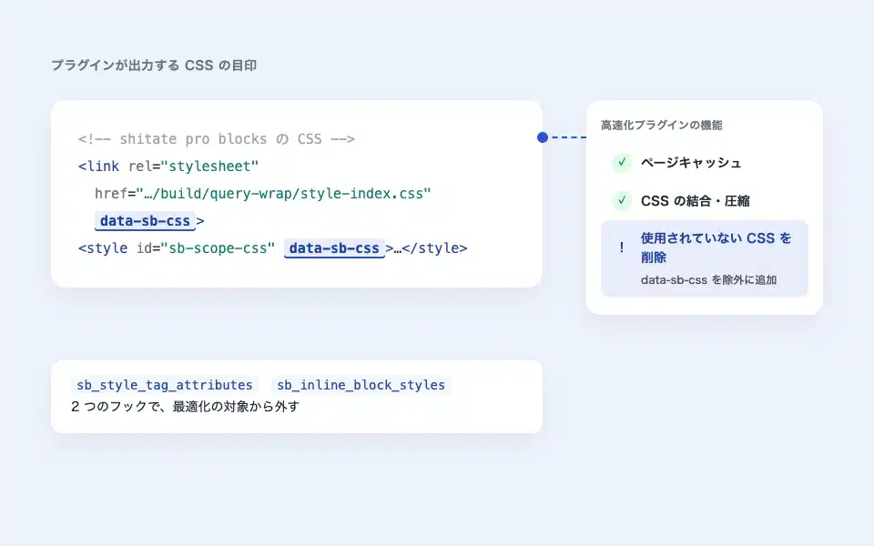
Used in conjunction with the Acceleration plugin (exclusions such as removing unused CSS)
When optimizing the CSS rebuild feature (like WP Rocket's "Delete unused CSS"), it breaks @scope...
-
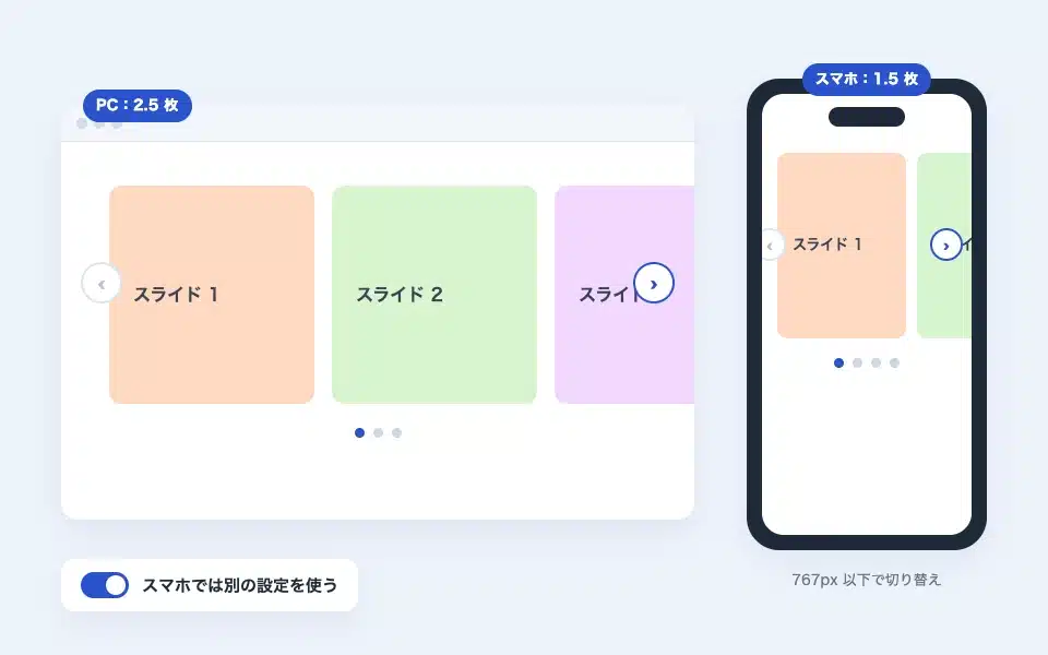
Settings for different smartphones for sliders (change the number of slides and arrows on PC and smartphone)
With the slider block, you can use a different setting (such as the number of images displayed at the same time, autoplay, arrows, dots, etc.) only for smartphones with a screen size of 767px or less…
-
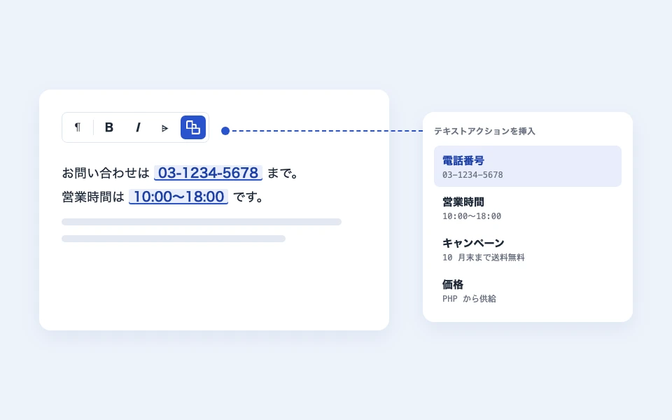
How to use text actions (common strings)
It is a mechanism that registers the names of frequently used strings and calls them from the editor’s text. Only references are stored in the body, and if the settings are changed, the…
-
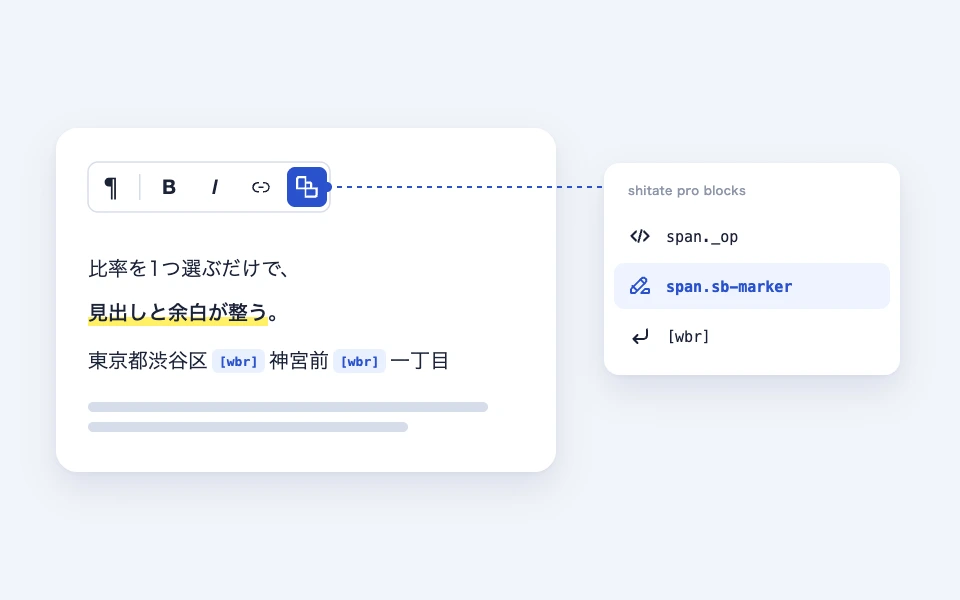
How to use the text toolbar (span-wbr)
A shitate dedicated button that is added to the toolbar for paragraphs and headings. Markers (span.sb-marker) and free spans (…
-
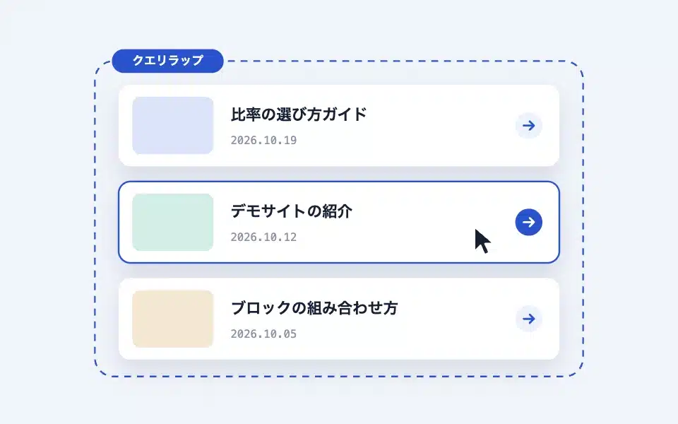
How to use the Query Wrap block
An accessible card block that can be used within WordPress standard query loops. It clicks the entire card into a clickable area, while retaining the real link...
-
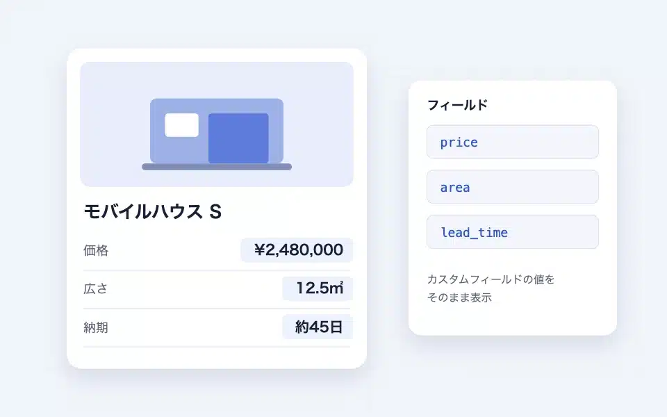
How to use the Field block
It doesn't appear in the scene; it's a "named container" that outputs the content to the same location as the action hook with the same name. How to name it, query looping versus...
-
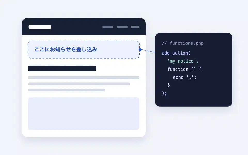
How to use the Action Hook block
An advanced block that inserts PHP output or the contents of the field blocks into the block’s position. How to choose a hook name, fields…
-
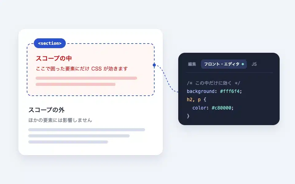
How to use the scope (scoped CSS/JS) block
A group-like block where you can select which HTML tags to surround. Scope CSS only works within this block (front editor/front…
-

How to use the if (conditional) block
A block that displays the results using if / else if / else. Page type, post type, taxonomy, login status…
-

How to use the dialog (modal) block
A block that, when pressed, opens a modal in a native dialog. Button text, style, size, placement, arrow, modal...