

Not only does shitate allow you to use 14 new blocks, but you can also add them to the WordPress theme you're currently using to gain access to them.
I believe we can significantly increase production speed by incorporating a perspective unique to a production company.
Please give it a try this opportunity.
Launch campaign: We have a coupon available for purchases made by December 31 that gives you a 50% discount forever, even after renewal.
The discount will be applied by entering the promotion code "SHITATE09" on the checkout screen.
Launch campaign coupon
SHITATE09
If you enter this, you can continue to use it with a 50% discount forever even after the update!
Unique blocks
These are original design blocks tailored to the shitate tone and style, primarily intended for blog writing.
Speech Bubble
 Creator
You can include a design that looks like a conversation using icons and speech bubbles like this!
CreatorYou are free to invert the icons or change their colors as well!
However, we do not provide designs other than speech bubbles; we will consider it if there are many requests!
Configurable items
- Avatar image and name (name can be empty)
- Avatar position (Left / Right)
- Bubble background color (sidebar color picker, CSS variable
--sb-bubble-bgenters) - Bubble text color (also color picker. CSS variables
--sb-bubble-colorenter, and it becomes the text color inside the speech bubble)
If you want to change the background color or text color across the entire site at once, override the variables on the theme side.
.sb-speech-bubble > .-body {
	--sb-bubble-bg: #fff7e6;
	--sb-bubble-color: #3a2a00;
}
Table of Contents block
You can display a simple table of contents. The text for the "Table of Contents" section can be changed to anything you like, and you can also style the heading list with dots or make it collapsible like an accordion (the collapsible version can also be set to closed by default). Whether placed in the post content or in a post template via the site editor, the same table of contents will be generated from that post's headings.
Since it intentionally features a simple design, it is structured to be easily adjustable with CSS.
Configurable items
- Title (or "Index" if empty)
- Heading level (up to which level to extract from H2. Default is up to H3)
- Numbered / Bulleted list
- Whether to make it collapsible/accordion (CSS and JS are shared with the details block)
Anchors are automatically assigned to headings, so there is no need to configure anything on the heading block side.
The text "Index" is included as the initial value, but you can change the initial value for the entire site using the following hook (it is also reflected in the editor placeholder).
add_filter( 'sb_toc_default_title', fn() => 'Table of Contents' );Smooth scrolling is enabled with a filter.HTML に scroll-behavior: smooth To solve this, not only the table of contents but all anchor links on the page scroll smoothly (this does not apply to users with reduced motion settings enabled). If there is a fixed header, you can also specify margin equal to its height.
add_filter( 'sb_toc_smooth_scroll', '__return_true' );
add_filter( 'sb_toc_scroll_padding', fn() => '5rem' ); // Height of fixed header (optional)
Flexible Posts
This is one of the features I put the most effort into during the development of the block plugin.
This is a post list block that allows you to freely change the display style depending on the device, such as displaying as a card format by default, but switching to a slider only on mobile view.
On this page, 6 items are displayed, but on smartphones, it changes to a 3-item slider.
The contents of the card are fixed as "thumbnail, title, category + date, and excerpt." Instead of rearranging the contents using blocks, the design is adjusted using settings and hooks.
Configurable items
- QueryPost type, taxonomy and terms, number of posts to display (1-24)
- DisplayDisplay mode (auto / grid / slider), number of columns (1 to 6), slider on mobile only, loop playback, dots, arrows
- Card: Title tag (div / H2 / H3 / H4, default is div), date (publication date / update date (publication date if no update) / publication date and update date / none, default is update date), excerpt display
"Auto" is a mode where it becomes a slider only when the number of posts is greater than the number of columns. Card hover is the same as blog links, where the border turns the brand color and a light shadow appears.
The number of columns changes according to the screen width.
The grid columns are not fixed; they wrap automatically using "content width ÷ number of columns" as the minimum width for a single column. On narrow screens, columns decrease one by one, and when placed on wide or full-width displays, they increase. The initial number of columns and the gap can be changed using CSS variables on the theme side.
:root {
	--sb-post-list-cols: 4;            /* 列数の初期値(ブロックで列数を指定した場合はそちらが優先) */
	--sb-post-list-gap: 1rem;           /* カードの間隔(初期値は --st-space-l) */
	--sb-card-ratio: 4 / 3;            /* サムネイルの比率(初期値は 1.618 / 1) */
}
Reorganize cards with hooks
Cards can be modified with a three-stage filter. Each has a version common to all blocks and a block-specific version (_post_list / _query_wrap) is available.
sb_card_args: Setting override (title_tag / date_type (published / modified / both / empty string) / date_format / date_labels / date_label_published / date_label_modified / taxonomy / terms_link / thumb_size / thumb_sizes / thumb_link / excerpt / excerpt_words)sb_card_partsHTML array of thumbnail / title / meta / excerpt. You can add, delete, and reorder them.sb_card_html: Final card HTML
// 日付の書式を変え、可変ポストだけ抜粋を外す
add_filter( 'sb_card_args', function ( $args ) {
$args['date_format'] = 'Y.m.d';
return $args;
} );
add_filter( 'sb_card_args_post_list', function ( $args ) {
$args['excerpt'] = false;
return $args;
} );
// カードにカスタムフィールド「price」を追加する
add_filter( 'sb_card_parts', function ( $parts, $post_id ) {
$price = get_post_meta( $post_id, 'price', true );
if ( $price ) {
$parts['price'] = '<p class="-price">'' . esc_html( $price ) . ''</p>'';
}
return $parts;
}, 10, 2 );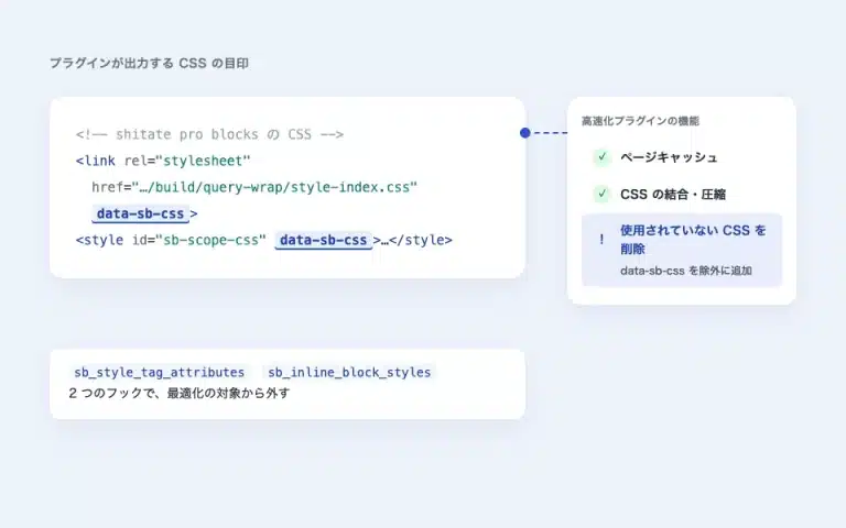
Slider
You can create several sliders using the Splide JavaScript library. Please choose from the following three:
- Block slider that slides element by element, including the background
- Media slider with thumbnail slider
- Logo slider, like the ones often seen on corporate websites, designed to make multiple logos continuously scroll horizontally
- Developer
Contents of the first slider
 Client
The second slider








Configurable items
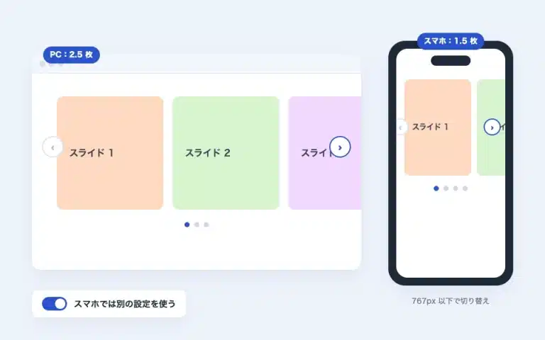
- CommonSwitching effects (slides / fades; the fade is always one at a time, looping playback returns to the beginning of the last one), the number of slides per screen, looping playback, auto-play (intervals of 2 to 10 seconds; stop by hovering), the speed of switching, arrows (display and position: point at the edge / inside / next to the dot on the bottom), dots (point / number / progress bar), center the current slide, allow dragging / swiping. When you turn on "Smartphone (767px or smaller)" in the panel, you can set the number of slides, auto-play, arrows, and dots (in media, display thumbnail strip; in logo, width and speed) for smartphones separately. When turned off, the common settings apply to the entire screen, and the number of slides is automatically reduced based on the screen width (maximum 2 for 1023px or smaller, 1 for 767px or smaller).
- Block slider: Background image, overlay color and opacity, and minimum height for each slide. You can place any blocks inside the slides.
- media sliderImages are managed by the block itself. When no image is available, upload from the placeholder or select it from the media library (drag and drop). When an image is present, hover over each image to select "Next, Back, Delete," add it from the bottom of the grid, or use the "Edit Image" tool in the toolbar to rearrange the entire image on the media library. A thumbnail strip is displayed below the slides. You can also set the slide height (as is / 16:9 / 4:3 / 3:2 / 1:1), caption display (media library captions), and link per image (from the grid link button; new tabs are also available). The corners of the images and thumbnails are always square.
- logo sliderWidth of one item, scrolling speed. When the number of items is small, it fills automatically and does not create margins.
Images are not delivered in their original saving size, but in a size suited for display (with srcset). If you want to change the size, you can specify it using a filter.
add_filter( 'sb_slider_image_size', fn() => 'large' );      // Media / logo slide image (default: media 2048, logo medium)
add_filter( 'sb_slider_thumb_size', fn() => 'medium' );     // Thumbnail strip (default: thumbnail)
add_filter( 'sb_slider_bg_size', fn() => '1536x1536' );      // Block slider background (default: 2048x2048)
add_filter( 'sb_slider_eager_count', fn() => 2 );           // Number of initial slides without lazy loading (default: 1 per screen)
The slide background overlay, in addition to per-slide settings, can also be set via CSS variables --sb-overlay(intensity 0 to 1) and --sb-overlay-color But it can be adjusted.
Blog Link
Just enter the URL, and it will retrieve the title, description, and image (OGP) of the destination to create a link card. The retrieved content is cached and can be re-fetched using the "Update" button in the sidebar. Pages within your own site will use the post data as-is.
Related reading Home Release Campaign: Buy before December 31st and get 50% off after the update (code SHITATE09). View pricing →… shitate
Configurable items
- URL, small label above the title (default is "Recommended reading". If blank, uses the default; hides when "Show label" is turned off)
- Display image / Display description
- Open in a new tab
- "Update" button (clear cache and reload)
The acquired content is cached for 30 days, and if it is older than a week, it is re-fetched in the background while keeping the current display. The page display never waits for the external site to respond. The period considered "old" and the initial value of the label can be changed using filters.
add_filter( 'sb_blog_link_fresh_ttl', fn() => DAY_IN_SECONDS ); // Default is WEEK_IN_SECONDS
add_filter( 'sb_blog_link_default_label', fn() => 'Related Article' ); // Default label
Layout
This is a responsive grid without breakpoints. By simply deciding the "minimum width of one column," the boxes automatically wrap according to the screen width. You can freely put blocks inside each box, make the entire box a link, or apply a background image. The beginning of this page is also built using this block.
Configurable items
- Layout: Minimum width of one column (e.g., 16rem, 240px). Also supports wide and full-width.
- Link to the boxWhen you set the URL, the entire box becomes a link. What is saved is
<a class="sb-box" href="/en/…/">Since the box itself is a link element, the class remains the same; so it works without JS, and you can even select the inner element directly in the browser verification tool. Since you can’t place links or buttons inside the link, a warning will appear in the sidebar if there are any inside. You can also set the link name for opening in a new tab, rel, and for screen readers.
Semantic blocks
It is a simple group of blocks that can handle HTML tags like details, dl, and dialog as they are, rather than being fixed in purpose and design like unique blocks.
We named it after the tag itself, assuming it would facilitate communication on the production floor.
The design is kept to a minimum, and rounded corners are not applied by default. Rounded corners can be specified collectively using CSS variables (common to speech bubbles, table of contents, cards, details, and dialog).
:root {
	--sb-radius: 0.75rem;   /* カード・吹き出し・ボタンなどの角丸 */
	--sb-radius-s: 0.25rem; /* 小さな要素(ラベル・閉じるボタンなど) */
}
details
It is in a so-called accordion block.
You can set whether it opens or closes by default for computers and smartphones separately, and if you set it to "opening one closes other items," only one of the linked items will remain open.
Configurable items
- 親: Style (Standard / Bordered), "Open one closes others"
- Each itemTitle, open in initial state on PC, open in initial state on smartphone (breakpoint is 768px)
- Structured dataIf you turn on "Output structured data (schema.org FAQPage)", JSON-LD is output as the title of each item and the text in the content as the answer (in the same format as the dl block). Turn it on only when the item is a FAQ.
The open/close icon displays plus/minus SVGs using a mask, and when closed, --sb-icon-closewhen open --sb-icon-open Use this. Since it cross-fades while rotating, the animation remains stable no matter what icon you replace it with.
.sb-details {
	--sb-icon-close: var(--sb-icon-chevron-down); /* 内蔵アイコン: plus / minus / chevron-* / arrow-* / triangle-up / triangle-down */
	--sb-icon-open: var(--sb-icon-chevron-up);
}

/* 自前の SVG を使う場合 */
.sb-details {
	--sb-icon-close: url("data:image/svg+xml,...");
}
It opens by default on a PC.
DeveloperYou can freely insert blocks into the opened content area.
It opens by default in SP.
Opening this will close the upper block.
This feature can also be disabled
Both are closed.
The parent block provides a setting to "close other items when one is opened."
By using this, multiple details can be prevented from being displayed, which saves screen space.
download
This block is designed to be used for content descriptions or FAQ (Frequently Asked Questions) style layouts.
A list defining sets of "terms (dt)" and "their descriptions (dd)"is a tag for creating
The main features and instructions for use are as follows.
- components
-
<dl>Enclose the entire list.: Term or heading (Definition Term).: The explanation and details (Definition Description).
There are multiple inside the listやIt is also possible to place [it/them], allowing for flexible information grouping.
It can also be exported as structured data (schema.org FAQPage). Terms will be output as questions and descriptions as answers (Google currently limits the display of FAQ rich results).
Configurable items
- Adding and reordering terms (dt) and descriptions (dd). You can place arbitrary blocks inside the descriptions.
- Whether or not to output structured data (FAQPage)
- What is the purpose of this block?
-
It is suitable for structuring information where items and content are paired, such as dictionary-like glossaries, FAQs (questions and answers), and product specification lists.
This is effective from the perspective of accessibility and SEO, as it correctly conveys the semantic meaning of "being a pair" to browsers and search engines.
dialogue
It looks like a normal button, but when clicked, it can display a different element in a modal popup.
Since smartphone browsing has also been increasing recently, one of the advantages is that users can quickly view details on a small screen.
Configurable items
- Button text, style (filled / outlined), size (small / medium / large), alignment, presence of arrow icon
- modal background color (CSS variable
--sb-dialog-bg) - You can put any blocks inside the modal. It closes with the close button, by clicking the background, or by pressing the Esc key.
The arrow icon's SVG can be replaced with a filter.
add_filter( 'sb_modal_arrow_svg', function () {
	return '<svg viewBox="0 0 24 24" aria-hidden="true"><path d="M5 12h14M13 6l6 6-6 6" fill="none" stroke="currentColor" stroke-width="2"/></svg>';
} );
if
This is a block that allows you to configure PHP if / else if / else statements. It evaluates the branches (conditions) from top to bottom and displays only the first branch that meets the condition. In the editor, a summary of the configured condition is displayed next to the label of each branch.
Things that can be used for conditions
- When / DeviceStart date and end date (if only the date is entered for the end date, the end of that day is included); device (only smartphone / only PC). The server determines this using the user agent of the browser (not the screen width). Sites that use page caching have the initial visitor's determination saved, so if the device, login status, and date conditions are not included in the cache, please do not use the cache or disable it.
- InvertDisplay when conditions are not met (NOT)
Branches with multiple conditions set are displayed when all of them are met. The "else" branch acts as a catch-all when none of the conditions are met.
Only the selected branches are displayed, but the description (meta description) automatically generated from the body of the page may contain text from all the branches. If you are concerned, please manually set the description.
You are looking at this on a PC right now, aren't you?
This is a string of text that cannot be viewed on a smartphone.
scope
You can set the HTML tag surrounding the content using radio buttons. You can choose standard ones like div, section, article, and main, as well as more obscure tags like hgroup.
Since we are also considering creating a mega menu, enclosing it in this block should enable a wider range of development possibilities.
Also, you can write scoped CSS that only affects the block enclosed here, and JS that runs only once immediately after the block, using tab switching. You can add styling and small animations that don't affect other elements without touching the theme.
In the demo, this feature is used to make only this element red.
DeveloperBy the way, for the sticky table of contents on PC, I added this block, adjusted the design, and included JavaScript to change the table of contents color depending on the display location.
Configurable items
- Tags: div / section / article / nav / main / aside / hgroup / header / footer (maximum one main per page)
- Color and marginsYou can set the text color and background color in the "Color" section of the sidebar, and the padding in the "Dimensions" section (this is the standard WordPress setting; you can use the theme's palette and presets).
- Wide / Full-width
- Front Editor TabCSS that applies only to this block. Nesting can be used, and declarations without a selector apply to the block itself. It works in both the editor and the front end.
- Front only tabIt is the same CSS scope, but it only works for the front end and is not applied to the editor. Specify here for hover effects, animations, and element hiding, among other things that interfere with editing. Output as the same class rule along with the content of the front-end editor tab.
- Only the editor tabIt’s a CSS effect that only works for the editor preview; it’s not outputted to the front at all. It’s used for specifying things that make it easier to edit, such as borders, placeholders, and extra space during typesetting.
- JS tab: JS executed only once immediately after the block on the front end. When the block element
theis passed as. It is not executed within the editor. - code editorThe CSS / JS input field is a VS Code-style code editor (CodeMirror). In addition to syntax highlighting, it supports indentation with Tab / Shift+Tab, auto-indentation on Enter, auto-closing brackets, comment toggling with Ctrl+/ (⌘+/), searching with Ctrl+F (⌘+F), moving lines with Alt+↑↓, and multi-selecting matching words with Ctrl+D (⌘+D). The editor itself is loaded only when the tab is first opened and is not included in the frontend.
/* Example of code to write in the CSS tab: The background of the block itself and the color of the paragraph inside it */
background: #fffaeb;
padding: 24px;

p {
    color: #c80000;
}
// Example of writing in the JS tab: Add a click handler to the button inside the block
el.querySelector('button')?.addEventListener('click', () => {
el.classList.toggle('is-open');
});Because the JS tab can execute arbitrary code, just like the WordPress Custom HTML block unfiltered_html Administrator or editor permissions are required. If a user without permissions saves, the JS will be removed.
Master blocks
The master block is not intended for those without production knowledge, but rather designed to be widely utilized by individuals well-versed in production as a foundation for delivering work to clients.
Basically, it makes no sense on its own, but by combining it with other blocks or PHP customization, advanced customization that cannot be done with no-code tools becomes possible.
However, please handle it with care, as misuse can conversely affect the site's display.
DeveloperOf course, it is possible to create a highly designed site without using master blocks.
Blocks in this category are expected to be highly effective for business sites.
action hook
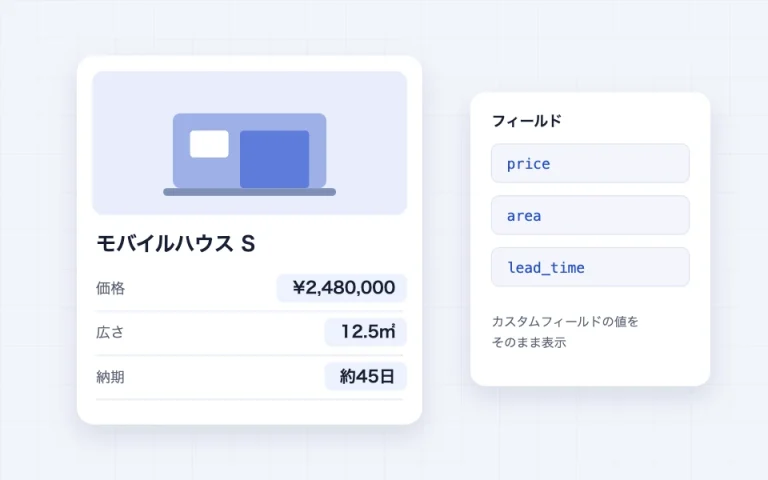
You can create custom action hooks that were once part of classic themes. This allows you to display content created with plugins like WPCode or custom plugins, and enables customizations that cannot be achieved with block themes alone.
I think it will make a significant contribution to product introductions, customer testimonials, and other content where a consistent template needs to be reused, by combining it with field blocks.
Configurable items
- Hook name: lowercase alphanumeric characters and – _ only. The hook that fires is
sb_action_{name} - Mode"Field" outputs the contents of the field block of the same name at this position (can also be processed with PHP). "PHP" displays only the PHP output without using fields.
- Editor's note (will not be displayed on the frontend)
How to use from PHP
Field contents $fieldFour items are passed: block attributes, block body, and target post ID. What is echoed will be output as-is (in field mode, if nothing is echoed, the field content is output as-is).
// フック名「catch」のブロックの位置に出力する
add_action( 'sb_action_catch', function ( $field, $attributes, $block, $post_id ) {
echo '<div class="catch">'' . $field . ''</div>';
}, 10, 4 );
// PHP モードでカスタムフィールドを出す(クエリループ内では各項目の投稿 ID が渡る)
add_action( 'sb_action_price', function ( $field, $attributes, $block, $post_id ) {
echo esc_html( get_post_meta( $post_id, 'price', true ) );
}, 10, 4 );
// すべてのアクションフックブロックで発火する共通フック
add_action( 'sb_action', function ( $name, $field, $attributes, $block, $post_id ) {
// $name にフック名が入る
}, 10, 5 );Please handle the action hook block with care, as misusing it can significantly impact how the page is displayed.
Field
Elements enclosed in field blocks are not displayed on the actual page as they are. By combining them with action hook blocks, you can create a foundation for controlling the content of multiple pages.
Configurable items
- Field nameLowercase alphanumeric characters, hyphens (-), and underscores (_) only. Action hook blocks with the same name will be the output destination. The name is locked to prevent accidental changes, and can be unlocked by clicking "Rename".
- Make it available in the query loopWhen turned on, an action hook with the same name placed in a query loop (including query wraps) for archives or similar will extract this content from each item's post and output it. Fields that are turned off will not appear in the list.
- PHP hook:for that field
add_actionDisplay the template and use the "Copy" button to paste it.
Example of use: Place a "catchphrase" field in each article, turn on query loop support, and place an action hook with the hook name "catch" in the article list template to display that article's catchphrase for each card in the list.
Query Wrap
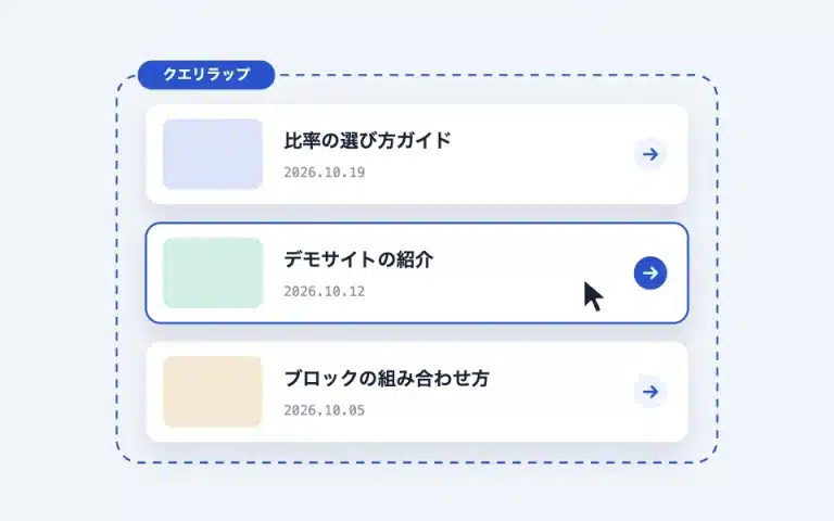
This is a block used within the standard WordPress Query Loop. It turns each item into a card consisting of a "thumbnail, title, category + date, and excerpt," making the entire card clickable. Since there is only one actual link (on the title), screen readers will not repeatedly read the link to the same article, and it does not interfere with text selection or operating buttons inside (accessible card pattern).
Configurable items
- Post title tag (div / H2 / H3 / H4, default is div)
- Date (Publication Date / Update Date (Publication Date if no update) / Publication Date and Update Date / None, default is Update Date. "Publication Date and Update Date" adds "Published" and "Updated" labels before each date, and displays only the publication date if there is no update. Whether an update exists is determined by comparing display formats, so re-editing on the same day is not treated as an update)
- Open in a new tab
Since it is the same card as the adjustable post,sb_card_* or group both cards together with a filter, or sb_card_parts_query_wrap can be recreated block by block (see the section on variable posts). Action hooks placed inside (fields supporting the query loop) are also output based on each item's post.
-
The annual plan for shitate pro blocks includes production companies…
-
Block Theme shitate (Shitate), Tailored Using the Type Scale…
Text toolbar
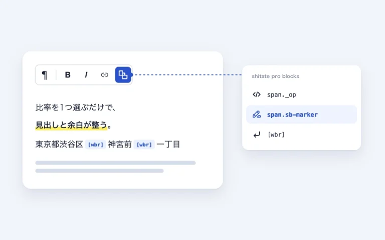
A dedicated shitate pro blocks button will be added to the toolbar for paragraphs and headings. To make it easy to distinguish from WordPress's standard formatting options, it has been combined into a single icon.
The same button can be used in the plugin's block-specific text fields, such as speech bubble names, details titles, dl terms, dialog button text, and table of contents titles, not to mention paragraphs, headings, and core tab labels.
- span._op: the selected text
<span class="_op">Enclose with. The appearance can be freely defined using the theme's CSS. - span.sb-marker:A thin tape-like marker like thisDraw.
- wbr tag: Specifies the positions where line breaks are allowed in the text.
word-break: keep-allbecomes, Shibuya-ku, TokyoJingumae Ichichome This prevents Japanese from wrapping at unintended positions, such as in "二番三号".
Span types can be added and changed using filters,
// スパンを追加する(class / ボタン名 / ダッシュアイコン名 / フロントとエディターに出す CSS)
add_filter( 'sb_span_formats', function ( $formats ) {
	$formats['note'] = array(
		'class' => '_note',
		'title' => 'span._note',
		'icon'  => 'editor-textcolor',
		'css'   => 'color:#c80000;font-weight:bold;',
	);
	unset( $formats['marker'] ); // 既存のスパンを外す
	return $formats;
} );

add_filter( 'sb_wbr_enabled', '__return_false' );     //  のボタンとショートコードを無効化
add_filter( 'sb_wbr_css_enabled', '__return_false' ); // keep-all の CSS だけ無効化
add_filter( 'sb_wbr_css_selector', fn() => 'h1, h2, h3, p' ); // CSS を当てる要素を絞る
Text actions
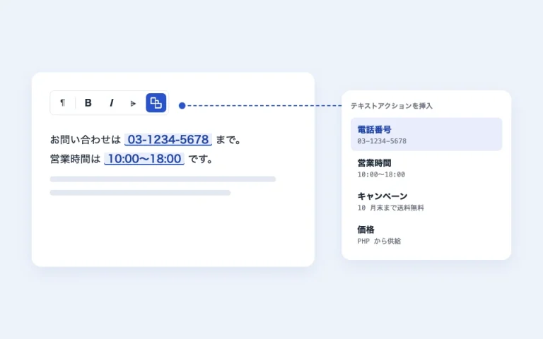
It is a mechanism that registers names to frequently used strings (phone numbers, business hours, campaign text, prices, etc.) and calls them from the editor's text. The information stored in the body is only for reference; changing the settings string will change the usage of the site as a whole. Details about the registration procedure, insertion and editing in the editor, and filtering to supply values from PHP are as follows. How to use text actions (manual) summarizing in
→ This string is inserted from the text action "Manual Demo" (if you change the setting, this location will also change together).
Multilingual support
The editor display and front-end text support Japanese, English, French, Spanish, Italian, Dutch, and Portuguese. They switch automatically according to the site's language settings, and unsupported languages are displayed in English.
Dashboard
Add the following widget to the dashboard in the admin panel (the display can be turned off individually in "Display Options").
- Site information(Administrators only): Displays the WordPress version and locale, the theme (and any child themes), the shitate pro blocks PHP version, the list of plugins currently enabled (including their versions), and the list of plugins that are currently installed. You can copy the entire list as text with the "Copy" button, so please paste it directly into your support request. The content is filtered.
sb_site_infoYou can change it later. - shitate update notesLatest updates for plugins and themes (3 latest updates and links to archives)
- shitate news:Information from the official website
Developer Reference
Here is a list of CSS variables and filters that creators can adjust from the theme or functions.php. For detailed usage, please refer to the section for each block.
CSS class naming
You can tell the origin of class names by looking at the beginning. Even without knowing naming conventions like BEM, you can write your own CSS just by remembering these three things.
sb-starting with: shitate pro blocks block body, or shared parts used in multiple blocks (sb-cardsb-togglesb-button). It has a standalone meaning. The name is the block name itself (variable post =sb-post-list, query wrap =sb-query-wrap)。-starting with: parts inside the block (-title-body-linketc.). It has no meaning on its own, and the parent'ssb-XXused as a set with. A container to hold any block must always-bodyIt is.is/has-: state or variant (is openis modifiedhas-bg). Other than thatwp-block-*やsplide__*and are classes added by WordPress and libraries, and plugin CSS does not depend on them.
The component is within the parent's scope, child selector > Specify using . Same part name (-title etc.) also exist in other blocks, so writing it as a descendant selector will also apply to nested blocks.
/* Components are paired with their parent, traced with > */
.sb-card > .-body > .-title {
	font-size: 1.125rem;
}

/* States use is- / has- */
.sb-details-item.is-open > .-title {
	color: var(--st-color-brand);
}

/* Using @scope allows writing safely without > (supported browsers only) */
@scope (.sb-card) {
	.-title { font-size: 1.125rem; }
}
What are the text decoration classes? sb-marker and, as an exception, short _op are the two.
License (100% GPL)
shitate pro blocks is licensed under the 100% GPL.All files—including PHP, JavaScript, CSS, icons, and translations—are provided under the GPL v2 or later, and the included libraries are also under GPL-compatible licenses (Splide and auto-scroll extensions: MIT; Tabler Icons: MIT; Lucide: ISC).What you are purchasing is the right to automatic updates and support; the blocks will function even without a license key, and you may use them on as many websites as you like under the terms of the GPL.
Use with the Acceleration Plug-in
The page caching and the ability to simply combine and compress CSS are not a problem. However, the ability to rebuild CSS (WP Rocket's "Remove unused CSS", LiteSpeed Cache's UCSS, and Critical CSS) is problematic. @scope Nested CSS may not be interpreted properly, for example, the query wrapper card will appear truncated at 1px. The plugin does not have processing tailored to specific acceleration plugins. Instead, we have prepared the following two hooks, so please combine them with your optimization settings to exclude the plugin's CSS from the scope of targeting.
sb_style_tag_attributes: The plugin outputs<link>And the scope block<style>Attributes to be attached to (array, default issb-data-css)。We can add the attributes that the optimization plugin will make into a "non-touchable landmark" here.sb_inline_block_styles:falseIf you return the value, WordPress will block the CSS.<style>Stop inlineizing it,<link>It is left as is (because attributes cannot be attached to inline CSS)
// 1. Do not inline block CSS  Leave it as it is (to assign attributes)
add_filter( 'sb_inline_block_styles', '__return_false' );

2. Add attributes if necessary (by default, data-sb-css is included)
add_filter( 'sb_style_tag_attributes', function ($attributes) {
	$attributes['data-no-optimize'] = '1'; // Example: Attribute that another optimization plugin will see
	return $attributes;
} );

// Example of excluding from WP Rocket's 'Remove unused CSS'
add_filter( 'rocket_rucss_skip_styles_with_attr', function ($attrs) {
	$attrs[] = 'data-sb-css';
	return $attrs;
} );
add_filter( 'rocket_rucss_external_exclusions', function ( $patterns ) {
	$patterns[] = 'data-sb-css';
	return $patterns;
} );
add_filter( 'rocket_rucss_inline_atts_exclusions', function ( $patterns ) {
	$patterns[] = 'data-sb-css';
	return $patterns;
} );
After the settings are made, please delete the generated CSS and page cache from the optimization plugin (in WP Rocket, you can choose "Delete used CSS" or "Delete cache").
Operating environment
WordPress 7.0 and later runs on PHP 7.4 and later (tested up to PHP 8.5). Browsers targeted are the latest versions supported by their respective vendors (Safari 17.4 and later, Chrome / Edge 118 and later, Firefox 128 and later, and their mobile versions). CSS @scope Because it uses relatively new specifications, the layout is preserved in older browsers on OSes that have reached end of support (such as Safari for iOS 16 or earlier, or Chrome 109 for Windows 7/8.1). However, some of the block decoration is not reflected. If you are using a plugin to combine and minify CSS, please use the latest version. For optimizations that rework the CSS (such as Remove Unused CSS and Critical CSS), @scope This can break the plugin. In that case, please exclude the plugin's CSS from the optimization targets (see "Using with Acceleration Plug-ins" below).
CSS variables
| Variable | Target | Initial value |
|---|---|---|
--sb-radius | Border radius of cards, speech bubbles, buttons, table of contents, details, and dialogs | 0 |
--sb-radius-s | Rounded corners of small elements (such as labels and close buttons) | 0 |
--sb-post-list-cols | Initial number of columns for adjustable posts | 3 |
--sb-post-list-gap | card spacing for adjustable posts | var(–st-space-l) |
--sb-card-ratio | card thumbnail ratio | 1.618 / 1 |
--sb-bubble-bg | speech bubble background color | var(--st-color-base-2) |
--sb-bubble-color | Balloon text color | inherit |
--sb-dialog-bg | modal background color of dialog | var(–st-color-base) |
--sb-icon-close / --sb-icon-open | collapse/expand icon for details (mask image) | plus / minus |
--sb-icon-{name} | Data URIs for 12 built-in icons (plus, minus, chevron-up/down/left/right, arrow-up/down/left/right, triangle-up/down) | — |
--sb-overlay / --sb-overlay-color | Block slider background overlay opacity and color | 0.4 / #000 |
--sb-logo-w | Width of a single logo slider (output from block settings) | — |
Filter action
| Hook | Use |
|---|---|
sb_card_args / sb_card_parts / sb_card_html(+ _post_list / _query_wrap) | variable post-query wrap card |
sb_action_{name} / sb_action | Output of the action hook block |
Table of Contents | Default table of contents title |
sb_toc_smooth_scroll / sb_toc_scroll_padding | Enabling smooth scrolling and margin for fixed header |
sb_span_formats / sb_wbr_enabled / sb_wbr_css_enabled / sb_wbr_css_selector | Text toolbar |
sb_slider_image_size / sb_slider_thumb_size / sb_slider_bg_size / sb_slider_eager_count | slider image |
sb_blog_link_fresh_ttl / Blog | Blog link cache update interval and initial label value |
sb_modal_arrow_svg | dialog button arrow icon |
sb_default_icons | Add or change built-in icons |
sb_assets_needles | String that triggers the loading of common styles (usually not required) |