

A dialog is a block that looks like an ordinary button, but when clicked it displays another content in a modal (pop-up). Native HTML <dialog> Because it uses the "Lock Background" function, the closing motion of the focus lock and the Esc key will remain the same as the browser standard. This is useful when you want to see the details immediately on the small screen of your smartphone.
Actual display
Since this manual is located on the site that is currently shitate pro blocks running, the following isReal blocks, not imagesHowever, please actually click on it, open it, and check the movement to confirm its functionality.
Basic usage
- From "shitate tag blocks" dialogue Add the
- Enter the text in the "Button Text..." field on the button.
- In the dotted frame "Modal Contents" below, insert the content you want to display in the modal into any block you want.
- In the sidebar, you can set the button style, size, arrow, and modal background color. You can choose the button placement (left, center, or right) in the toolbar.
Settings screen in the editor
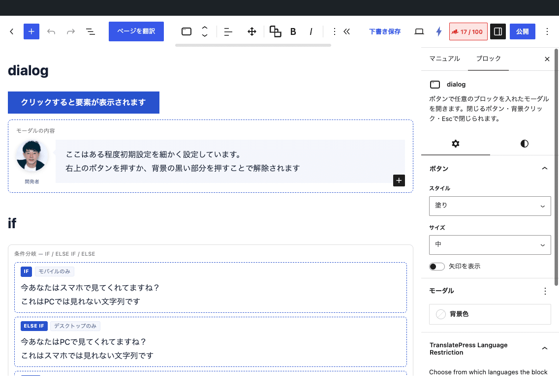
Settings
- Deployment(Toolbar) — Left (default value) / Center / Right.
- Style — Fill (initial value) / Border / Text.
- Size — Small/Medium (initial value)/Large.
- Show arrows — Add an arrow icon to the right of the button.
- Background color(Modal) — CSS Variables
--sb-dialog-bgIt goes into 16-bit format, color name, andvar(--…)Only rgb()/hsl() formats are accepted. - The wording of buttons can be decorated with shitate bold and italic text toolbars.
Movement at the front
- When you press the button
showModal()Then the modal opens, and the background becomes dark, making it impossible to operate. The focus moves into the modal. - There are three ways to close it: the X button in the top right, clicking on the background (the dark part), or the Esc key.
- The width of the modular is
min(92vw, 600px)The height is up to 85vh, and the contents that exceed that are scrolled within the modal. - In an environment where JS is disabled, pressing the button does nothing (the content is included in the HTML and is not displayed).
Change the arrow icon filter
add_filter( 'sb_modal_arrow_svg', function () {
	return '<svg viewBox="0 0 24 24" aria-hidden="true"><path d="M5 12h14M13 6l6 6-6 6" fill="none" stroke="currentColor" stroke-width="2"/></svg>';
} );
The returned SVG passes through sanitization (<svg Strings that do not contain the character will be empty). The preview in the editor is not reflected, only the front end changes.
HTML and CSS output
<div class="sb-dialog">
  <div class="-opener has-align-left">
    <button type="button" class="sb-button is-variant-fill is-size-medium has-arrow" data-sb-dialog-open>
      <span class="-text">Learn more</span><span class="-arrow">…svg…</span>
    </button>
  </div>
  <dialog class="-dialog" style="--sb-dialog-bg:…">
    <div class="-panel">
      <button class="-close" aria-label="Close" data-sb-dialog-close><span aria-hidden="true">×</span></button>
      <div class="-body">…The contents…</div>
    </div>
  </dialog>
</div>--sb-dialog-bg— Background of Modlar (initial value--st-color-base)--sb-radius— Rounded corners on buttons and modals,--sb-radius-s— Rounded corners of the close button (default value 0)- The button color is
--st-color-brandHover is--st-color-brand-hoverButton parts.sb-buttonIt is a shared component.
/* モーダルを広めに、背景の暗さを変える */
.sb-dialog > .-dialog { width: min(92vw, 800px); }
.sb-dialog > .-dialog::backdrop { background: rgb(0 0 0 / 70%); }
Points to note
- There is no automatic opening function using the URL hash.
- Even when placed in the "linked box" of the layout, the links and close buttons in the modal content still function correctly (fixed in 1.4.1).
- In 1.7.0, the class name has changed (example:
.sb-dialog__close→.-close)。Custom CSS for old class names does not work.