
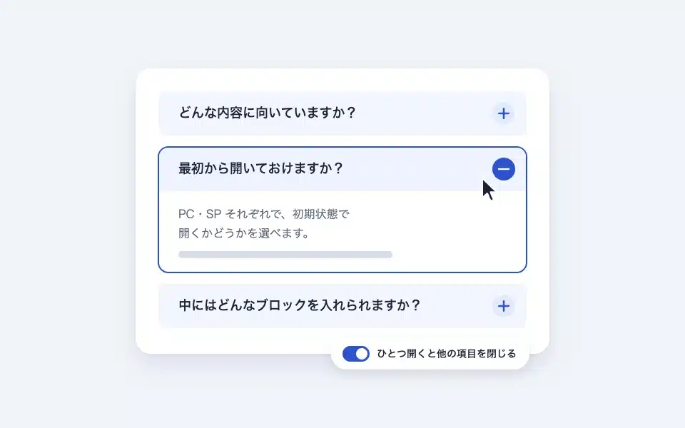
The details are in HTML. <details> /
Actual display
Since this manual is located on the site that is currently shitate pro blocks running, the following isReal blocks, not imagesHowever, please actually click on it, open it, and check the movement to confirm its functionality.
It opens by default on a PC.
 Developer
You can freely insert blocks into the opened content area.
It opens by default in SP.
Opening this will close the upper block.
This feature can also be disabled
Both are closed.
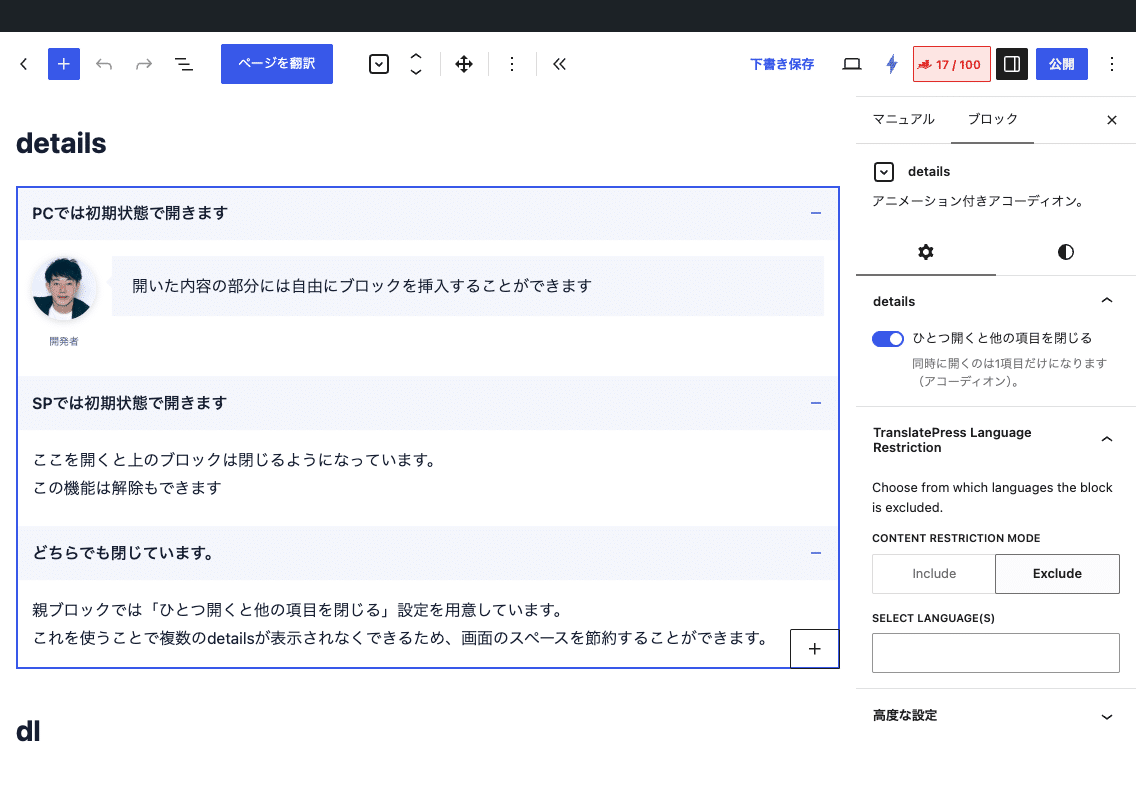
The parent block provides a setting to "close other items when one is opened."
By using this, multiple details can be prevented from being displayed, which saves screen space.
Basic usage
- From "shitate tag blocks" details We add the first item. Initially, there are two items.
- Click "Title..." for each item to enter a heading, and then insert any block of text below the heading.
- When adding more items, press the “+” at the end. You can always edit them in the editor while it is open.
- Select the parent block and set the style (default/box) and "open one to close the other items".
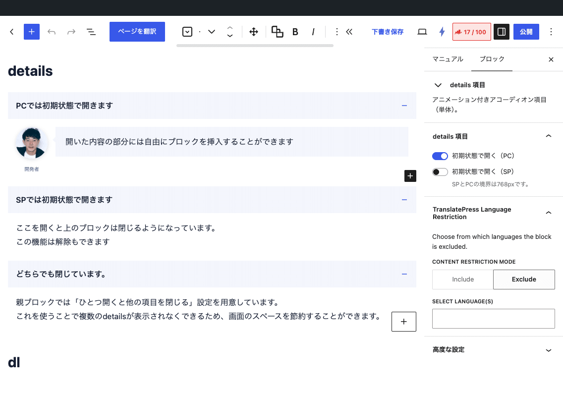
Settings screen in the editor
Settings
details (parent)
- Style — Standard (light background in the title row)/Box (frame around each item).
- Opening one of them closes the other items. — When turned on, items that are open within the same group are closed with animation, leaving only one item open at all times.
Each item
- Title — You can use bold and italic formatting shitate in the text toolbar.
- Opens in its initial state (PC)/Opens in its initial state (SP) — The border is 768px. Even when only one side is opened, the drawing is always drawn in the correct state before JavaScript starts, so there are no flickering issues.
Interchangeable with the "Details" block in the core
In the block transformation menu, you can interconvert with the WordPress standard "Details" block. By selecting multiple details blocks together and transforming them, they are grouped together as one details item. In the reverse direction, each detail block becomes an item within the details block.
Change the opening and closing icon
The icon shows a plus/minus SVG with a mask. When closed, --sb-icon-closewhen open --sb-icon-open Use it to create a crossfade while rotating 360°. One rotation returns the original orientation, so the movement remains stable no matter which icon is replaced. There are 12 built-in icons: plus/minus/chevron-up/down/left/right/arrow-up/down/left/right/triangle-up/down.
/* シェブロンに変える */
.sb-details {
	--sb-icon-close: var(--sb-icon-chevron-down);
	--sb-icon-open: var(--sb-icon-chevron-up);
}

/* 自前の SVG を使う */
.sb-details {
	--sb-icon-close: url("data:image/svg+xml,…");
}
HTML and CSS output
<div class="sb-details is-style-box" data-sb-exclusive="true">
  <details class="sb-details-item sb-toggle is-open" data-sb-toggle="item" open>
    <summary class="-title"><span class="-label">Title</span><span class="-icon" aria-hidden="true"></span></summary>
    <div class="-body">…The contents…</div>
  </details>
</div>--sb-toggle-pad-top/--sb-toggle-pad-bottom— The top and bottom margins of the text when opened (initial value--st-space-m)--sb-radius— Rounded corners in box style (default value 0)- The background of the title is
--st-color-base-2The icon color is--st-color-brandThe box's borders are--st-border-card
/* 開いている項目のタイトルをブランド色に */
.sb-details-item.is-open > .-title {
	color: var(--st-color-brand);
}
Points to note
- The opening and closing animations are controlled by JavaScript. In environments where JS is disabled, items saved in closed state will not display the body text.
- The PC/SP determination is only made once during page loading. After loading, the window width does not change; the initial state remains unchanged.
- Structured data is not output. If you want to include it in the search results as an FAQ, dl blockPlease use (FAQPage Output).
- The opening and closing of the table of contents block shares the same script and CSS with the details block.
- 1.6.1 Previous saved formats are automatically converted when opened in the editor. Old pages that haven’t been opened will lose their styles and animations, so please save them again.