

Slider Blocks are blocks using the lightweight slider library Splide. Choose from three types to suit your needs.
Actual display
Since this manual is located on the site that is currently shitate pro blocks running, the following isReal blocks, not imagesHowever, please actually click on it, open it, and check the movement to confirm its functionality.
Block slider(Background image + overlay)
 Developer
Contents of the first slider
 Client
The second slider
media slider(With thumbnail strip)




logo slider



- Block slider — Any block can be placed on each slide. You can also use it as a hero image with a background image and overlay.
- media slider — Select the images in a gallery-like way and arrange them. A thumbnail strip is available at the bottom.
- logo slider — It’s a marquee display where the business partner’s logo etc. keeps flowing horizontally.
Basic usage
- From "shitate unique blocks"SliderAdd "Type" to the sidebar and choose from three options.
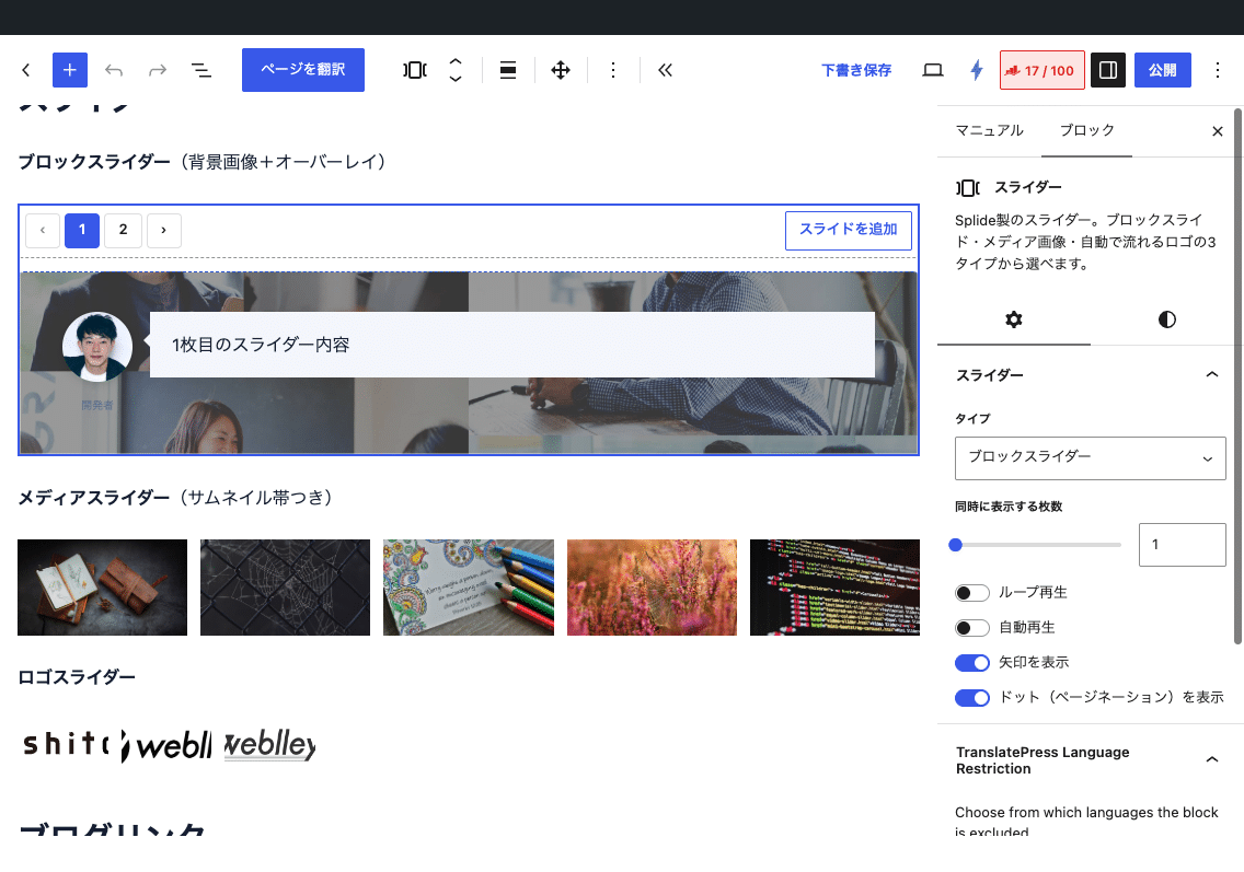
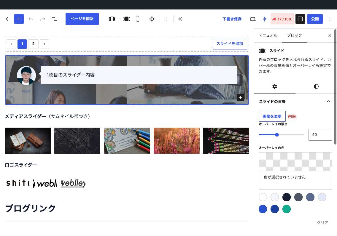
- Block sliderIn the case of: Use the number buttons at the top of the editor or the forward/backward arrows to switch between slides one by one while editing, then add them to the end with "Add Slide". When you select each slide, the background settings appear in the sidebar.
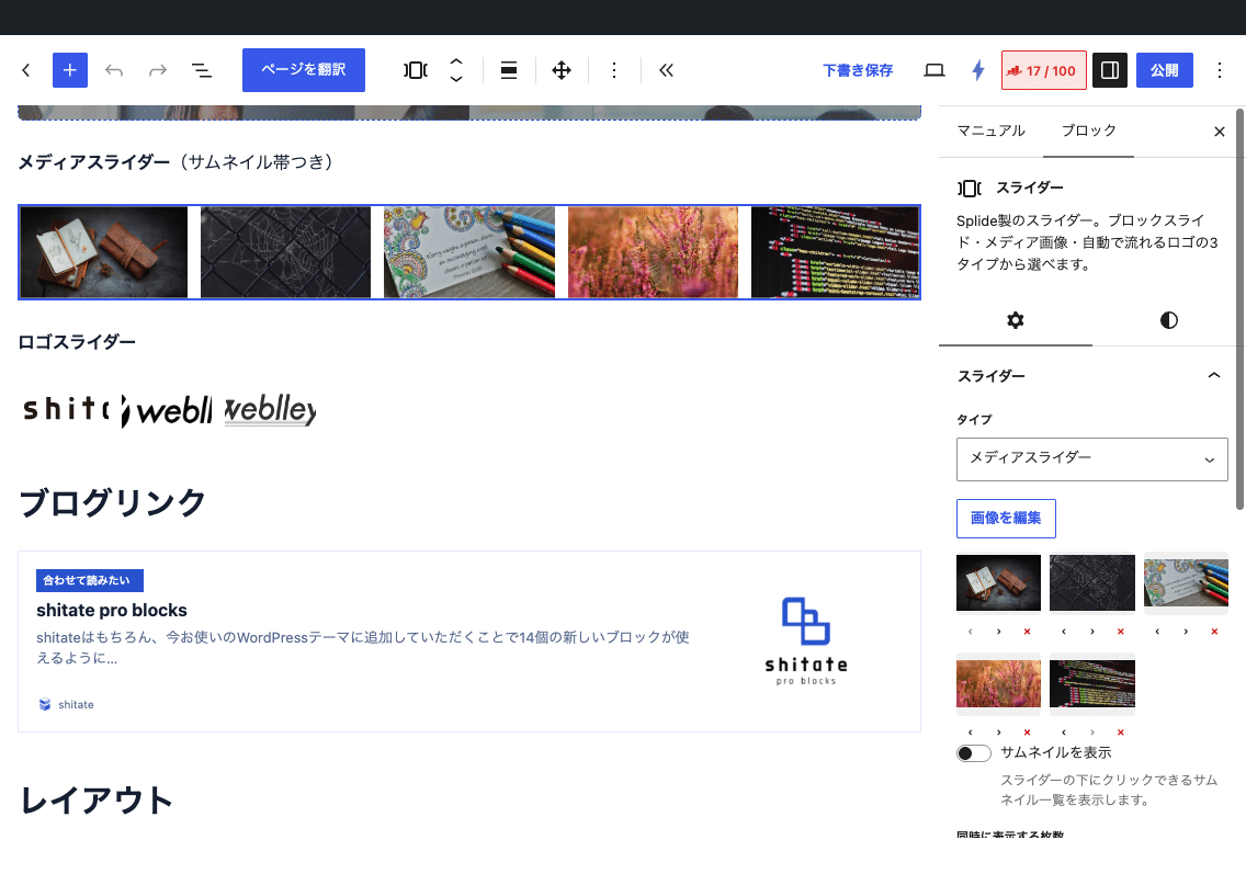
- Media/LogoIn the case of: In the "Select Image" section of the sidebar, select multiple images from the media library at once. Replying to the selection will replace the entire image. You can sort and delete individual images in the thumbnail list.
- 1 Set the number of slides per screen, looping, autoplay, arrows, dots, and more.
In the editor, the slider does not move (the blocks slider is one per page; the media and logo are in the grid preview). Please check the movement in the front-end.
Settings screen in the editor
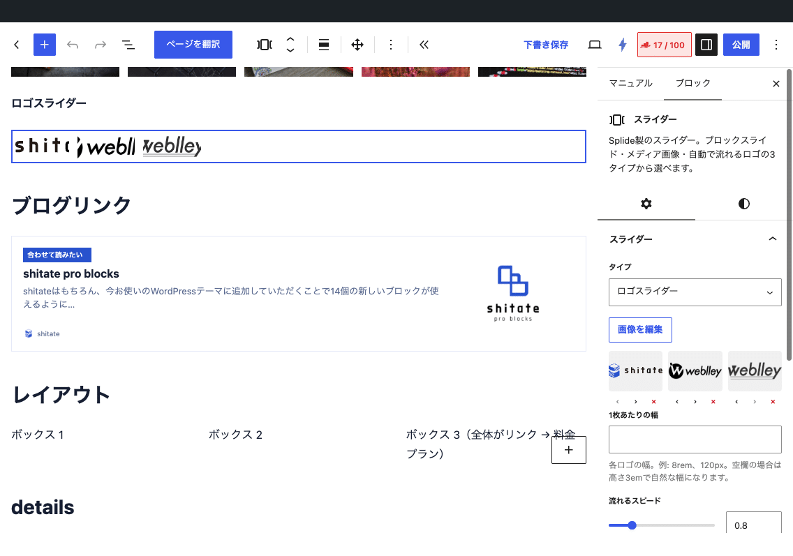
Settings
Common (Block/Media)
- Number of items displayed at the same time — 1 to 4 (initial value 1). When 2 or more, the maximum is 1023px, and the number of images automatically reduces to 1 when it is less than 767px.
- Loop playback/Auto-play(Pause for 4 seconds with hover) /Show arrows(Initial value on)Display dots(Initial value on)
- Suitable for wide placement of the entire width. When the entire width is used, the arrow is placed inside.
Each slide of the box slider
- Background image — When set, the cover is applied to the entire slide, and the content aligns vertically in the center.
- Opacity of the overlay(0 to 100, initial value 40)Overlay color(Initial value is black) — Only displayed when there is a background image.
- Minimum height — For example:
24rem、400pxSettings per slide. - You can also use the settings for the core color (background and text) and the margin (padding).
media slider
- Display thumbnail — Displays a thumbnail list that can be clicked below the slider and highlights the current position.
- The image is cropped (covered) to 16:9 and displayed.
logo slider
- Width per sheet — For example:
8rem、120pxIf the space is empty, the height will be 3em and the width will be natural. - Flowing speed — 0.2 to 3 (initial value 0.8).
- When the number of sheets is low, it is automatically duplicated until it reaches twice the track width, then moved. This means that even with 2 or 3 sheets, there are no interruptions or gaps. You can pause with the hover function and move freely with drag. Arrow, dot, and auto-play settings are not used for logos.
Image delivery size and filters
The images are not displayed in their original size but in sizes adapted to the display (with srcset). The first few images are read in a delayed manner. You can specify the size in the filter if you want to change it.
add_filter( 'sb_slider_image_size', fn() => 'large' ); // Slides of media/logo (default: media 2048, logo medium)
add_filter( 'sb_slider_thumb_size', fn() => 'medium' ); // Thumbnail strip (default value: thumbnail)
add_filter( 'sb_slider_bg_size', fn() => '1536x1536' ); // Background of the slider (default value: 2048x2048)
add_filter( 'sb_slider_eager_count', fn() => 2 ); // The number of slides at the beginning that does not load asynchronously (default: 1 = number of slides in the screen)
Customizing with CSS
The main body is .sb-slider(Status: is-mode-block / is-mode-media / is-mode-logo), each slide is .sb-slider-item(With a background) has-bg)、the parts are -overlay -body -thumbs -thumb That is to say, the arrow and dot are the brand colors (--st-color-brandIt is a common style with variable posts.)
/* オーバーレイをサイト全体で薄く・青みに */
.sb-slider-item {
	--sb-overlay: 0.25;
	--sb-overlay-color: #001a4d;
}

/* ロゴの幅はブロックの設定(--sb-logo-w)で決まる。CSS で上書きする場合 */
.sb-slider.is-mode-logo { --sb-logo-w: 10rem; }
Points to note
- If you save a slide created with the Box Slider with the type switched to media/logo, the slide content will not be saved. Please discard the contents before switching.
- The alt value of the image is saved at the time of selection. If you change the alt value in the media library later, please select the image again.
- Before JS is loaded or in an invalid environment, slides are displayed vertically (the logo is horizontally aligned). Arrows and dots are not displayed.
- 1.6.1 Previous storage formats (
sb-slider__itemFor example) will be automatically migrated when opened in the editor.