
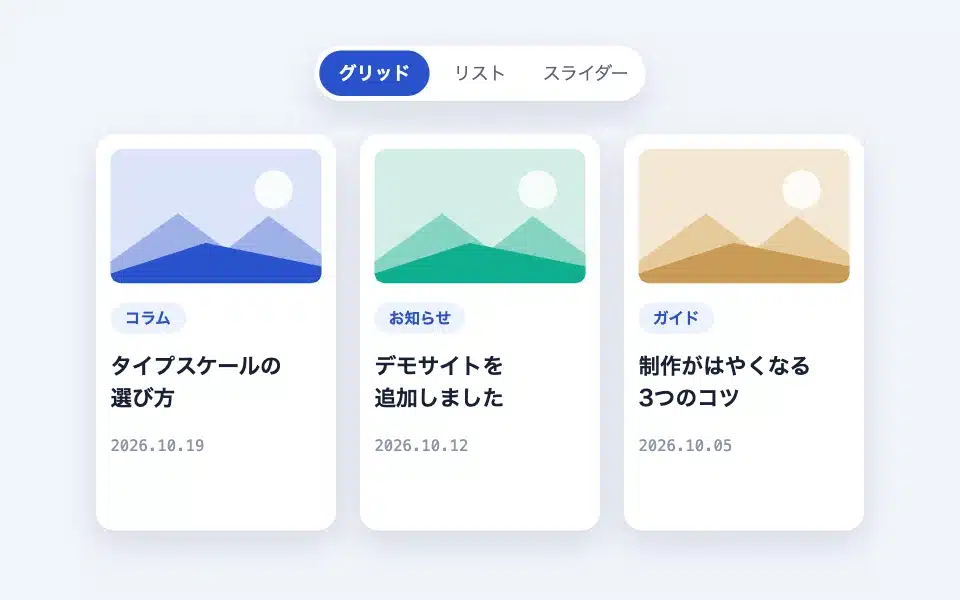
The Variable Posts are blocks that list posts that meet the criteria in a card format. Unlike PC where the display is grid-based, on a smartphone the display can be changed depending on the device. The contents of the cards are fixed in the form of a thumbnail, title, category, and date plus excerpts. Instead of changing the blocks, the design is designed to be adjusted using settings and hooks.
Actual display
Since this manual is located on the site that is currently shitate pro blocks running, the following isReal blocks, not imagesHowever, please actually click on it, open it, and check the movement to confirm its functionality.


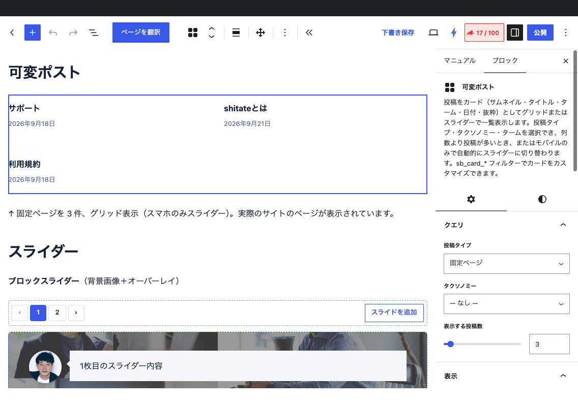
↑ Fixed page display of 3 items, grid display (only on smartphones: slider). The actual page of the site is displayed.
Basic usage
- From "shitate unique blocks"Flexible PostsThe editor will preview the actual post (the links in the preview cannot be pressed).
- In the "Query" sidebar, select the post type and, if necessary, the taxonomy term.
- In "Display," you can decide the display mode, the number of columns, and how to handle it on a smartphone.
- Select the title tag, date type, and whether or not to include excerpts with the "Card" option.
Settings screen in the editor
Settings
Query
- Post type — Choose from the types of posts that can be published (default: Posts). Changing this will reset the taxonomy and terms.
- Taxonomy — Choose from the options associated with the selected post type. If "None," no filtering will be performed.
- Term — Only displayed when taxonomy is selected. You can select multiple options.
- Number of posts displayed — 1 to 24 (initial value 6).
The order is fixed in descending order of date (newest first). There are no settings for sorting, offset, or excluding the current post.
Display
- Display mode — Automatic (default) / Grid / Slider. "Automatic" turns the slider on only when the number of posts retrieved exceeds the number of columns.
- Number of columns — 1 to 6 (initial value 3). It is the number of rows in the grid, and when the slider is used, it is the number of slides displayed on the screen.
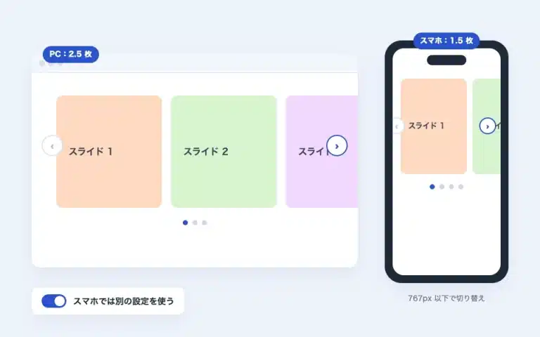
- Mobile only slider — Keep the PC on the grid, and only make the slider smaller than 767px.
- Loop playback/dots/arrows — Only displayed when set to slider mode.
Card
- Tags for post title — div (initial value) / H2 / H3 / H4. Choose according to the page’s heading structure.
- Date — Date of post/Last Updated (if not updated, the date of post is used as the default value) — Date of post and Last Updated — None. “Date of post and Last Updated” has the label “Post” or “Last Updated” before each date; if there is no update, only the date of post is displayed. The presence of an update is determined by the display format, so repeated editing on the same day will not be considered an update.
- View excerpts — Displays 32 words excerpted at the initial value.
The number of columns changes according to the screen width.
The grid columns are not fixed. The "content width ÷ column number" is set to the minimum width of a single column, and it will automatically be adjusted to the narrower width. In narrow screens, the columns are reduced one by one, and when placed at wide or full width, they are increased. The initial value and spacing of the column number can be changed in the theme's CSS variables.
:root {
	--sb-post-list-cols: 4;       /* 列数の初期値(ブロックで列数を指定した場合はそちらが優先) */
	--sb-post-list-gap: 1rem;     /* カードの間隔(初期値は --st-space-l) */
	--sb-card-ratio: 4 / 3;       /* サムネイルの比率(初期値は 1.618 / 1) */
	--sb-radius: 0.5rem;          /* カードの角丸(初期値 0) */
}
With the slider, the maximum number of slides is 2 at 1023px or less, and 1 at 767px or less. The arrows automatically align at the top, bottom, and center of the slide (even with dots or thumbnails, they don’t drift down).
Reorganize cards with hooks
Cards can be modified with a three-stage filter. Each has a version common to all blocks and a block-specific version (_post_list For query wrappers _query_wrap) is available.
sb_card_args— Overwriting the setting value.title_tag/date_type(published / modified / both / lowercase letters) /date_format/date_labels/date_label_published/date_label_modified/taxonomy/terms_link/thumb_size(Initial value: medium_large) /thumb_sizes/thumb_link/excerpt/excerpt_words(Initial value 32) /new_tab/title_classsb_card_parts—thumbnail/title/meta/excerptAn HTML array. You can add, delete, and sort it (you can do the HTML escaping yourself).sb_card_html— HTML of the final card
// 日付の書式を変え、可変ポストだけ抜粋を外す
add_filter( 'sb_card_args', function ( $args ) {
	$args['date_format'] = 'Y.m.d';
	return $args;
} );
add_filter( 'sb_card_args_post_list', function ( $args ) {
	$args['excerpt'] = false;
	return $args;
} );

// カードにカスタムフィールド「price」を追加する
add_filter( 'sb_card_parts', function ( $parts, $post_id ) {
	$price = get_post_meta( $post_id, 'price', true );
	if ( $price ) {
		$parts['price'] = '<p class="-price">' . esc_html( $price ) . '</p>';
	}
	return $parts;
}, 10, 2 );

// 部品の並びを変える(抜粋をタイトルの直後に)
add_filter( 'sb_card_parts_post_list', function ( $parts ) {
	$excerpt = $parts['excerpt'] ?? '';
	unset( $parts['excerpt'] );
	$reordered = array();
	foreach ( $parts as $key => $html ) {
		$reordered[ $key ] = $html;
		if ( 'title' === $key ) {
			$reordered['excerpt'] = $excerpt;
		}
	}
	return $reordered;
} );
HTML and class output
<div class="sb-post-list is-grid" data-sb-columns="3">
  <ul class="-track">
    <li class="-item">
      <article class="sb-card is-post-list">
        <a class="-thumb"><img …></a>
        <div class="-body">
          <div class="-title"><a class="-link">Title</a></div>
          <div class="-meta"><span class="-terms">…</span><time class="-date is-modified">…</time></div>
          <p class="-excerpt">…</p>
        </div>
      </article>
    </li>
  </ul>
</div>
The card style is common with Query Wrap (.sb-card)When writing your own CSS, .sb-card > .-body > .-title Please specify as a group with your parent. Hovering over the card will zoom in a little.
Points to note
- The editor preview is always in grid view. Please check the slider movement in the front view.
- In 1.7.0, the initial value of the title tag is div, and the initial value for the date has changed to the updated date. Existing blocks that have not been explicitly selected will display with the new initial value.
- The number of columns depends on the thumbnail size.
sizesIt automatically selects an image that is close to the display width.