
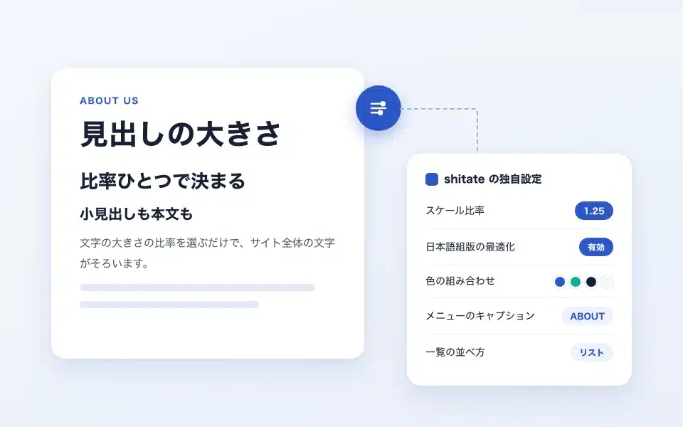
shitate(Citate) has shitate unique settings that are not found in other themes. On this page, we will introduce the settings that are only available in the free theme shitate, along with the actual settings screen, in order. We have written out what menu to open and where to press, so that even beginners to WordPress can proceed by comparing the screens.
It does not include the features of paid plugins shitate pro blocks; you can set everything up just by activating the theme.
* This is the screen as of October 2026 (shitate 1.0.6, WordPress 7.1). The screen was taken on a newly installed site.
Overview of the settings
Let me first check the terms used in this article.
- Admin panelThis is the screen that appears after logging in to WordPress, with a black menu on the left side.
- CustomizationThis is the overall site settings screen that you can open from "Appearance" in the management screen > "Customization." You can customize the site's appearance by checking the settings on the right side.
- EditorClicking "Appearance" > "Editor" opens the screen where you can edit the overall design and header of the site. When you click, "Design" will appear in the top left corner.
- Block: It refers to the components that make up a page, such as headings, paragraphs, and images. When you click on a block, the settings for that block are displayed on the right side of the screen.
shitate The unique settings and locations are as follows:
| Settings | Location | What you can do |
|---|---|---|
| Typography scale | Appearance → Customization | Just choose the ratio of the size of the characters and the entire site will be aligned. |
| Optimization of Japanese typesetting | Appearance → Customization | Make Japanese more readable by making it similar to reading a book or magazine. |
| Color combinations (styles) | Appearance → Editor → Style | Choose from 5 color combinations and change the colors |
| shitateSettings | Edit page posting and fixed page screens | Change the text size only for that page; hide the page title |
| Menu captions and buttons | Appearance → Editor → Patterns → Header | Insert a small explanation under the menu items; make the button for inquiries |
| How to sort the list | Appearance → Editor → Templates | Choose the blog list from the card list or row |
| Pattern | In the editing screen, click "+" → "Pattern" | Apply the finished design |
| Margins and block styles | The "Style" button on the right side of the block toolbar | Select the top and bottom margins in stages; change the appearance |
Size of characters and readability
Typography scale
shitate This is the most important setting. Choose one of 8 different "aspect ratios" to adjust the difference between the headline and the body text. Just by choosing an aspect ratio, the size of all the text in your site—from the large headline to the small annotations—is determined together. You don't have to adjust the text size one by one.
- Open "Appearance" > "Customization" in the menu on the left side of the admin panel.
- From the items listed on the left, press "Typography Scale."
- Select the ratio from the "Scale Ratio" list. The look of the right site changes immediately, so you can choose while comparing them.
- Once it is determined, press the "Publish" button in the top left of the screen. Until you press it, it will not be reflected in the site that visitors can view.
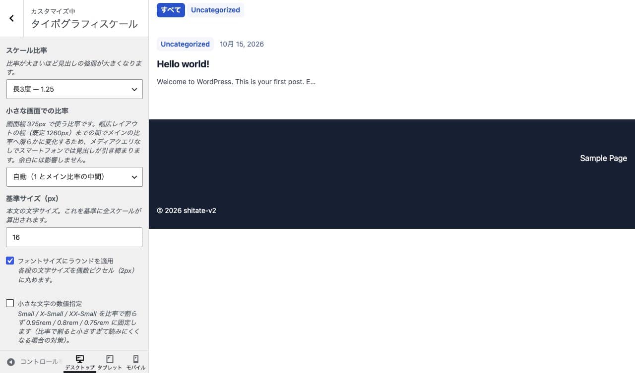
The ratio becomes larger the larger the number, so the difference between the title and the text becomes larger. It is named after the pitch of the music, but you don't need to worry about the name; you can choose it based on the size of the numbers.
| Ratio | First impression | Sites that are pointing to it |
|---|---|---|
| Short 2 degrees 1.067 / Long 2 degrees 1.125 | The difference between the headline and the body text is small, giving a calm impression. | Blogs with a lot of articles and sites with a lot of information |
| Short 3 degrees 1.2/Long 3 degrees 1.25 | With a slight difference, it has a readable and tidy appearance. | Company information, store website, etc. If you’re confused, just go here. |
| Total 4 times 1.333 / increase 4 times 1.414 | The headline is clearly large and has a distinct sense of balance. | Service Introduction, Recruitment Site |
| Perfect 5 degrees 1.5/golden ratio 1.618 | The headline is very large and memorable. | Landing page, work introduction |
The other settings on the same screen are as follows:
- Small-screen ratioThis is the ratio when viewed on a smartphone. If you leave the first option (Auto (Middle of Main Ratio)) unchanged, the heading will be slightly smaller on the smartphone and less likely to protrude from the screen.
- Reference size (px)The size of the text in the document. Initially, it is 16. For sites where many older people read, setting it to 17 or 18 makes it easier to read. The size of the headings also changes automatically to match this value.
- Apply a round to the font size:Aligns the size of the characters to a nice even number. The check is already on. It’s fine to leave it as is.
- Numeric specification for small charactersThis reduces the size of small characters like annotations when the ratio is reduced, preventing them from becoming too small. If you find the small characters difficult to read, please check the box.
The spacing between paragraphs and before and after headings does not change even if the ratio is changed. By using the 1-line-width as a reference, the spacing before the heading is wider and the spacing immediately after the heading is narrower, and it is automatically adjusted accordingly.
Optimization of Japanese typesetting
This setting creates clean Japanese-language text that is similar to books and magazines. It works when the site's language is Japanese. It is initially turned off.
- Open "Appearance" → "Customize" → "Typography Scale"
- Check the box next to "Optimizing Japanese typesetting."
- Press the "Publish" button
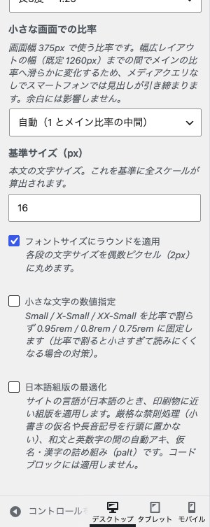
If you check the box, the following three things will be done automatically:
- Make sure there are no small characters like "ya" or "er" at the beginning of the line or stretching bars.
- Place a small gap between the Japanese and English digits (for example, between "WordPress").
- Fill in the kanaya spacing to tighten the arrangement of the characters.
The color of the entire site
Choose the color combination
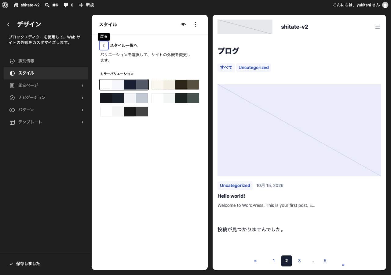
shitate It includes five color combinations, including the standard color scheme.
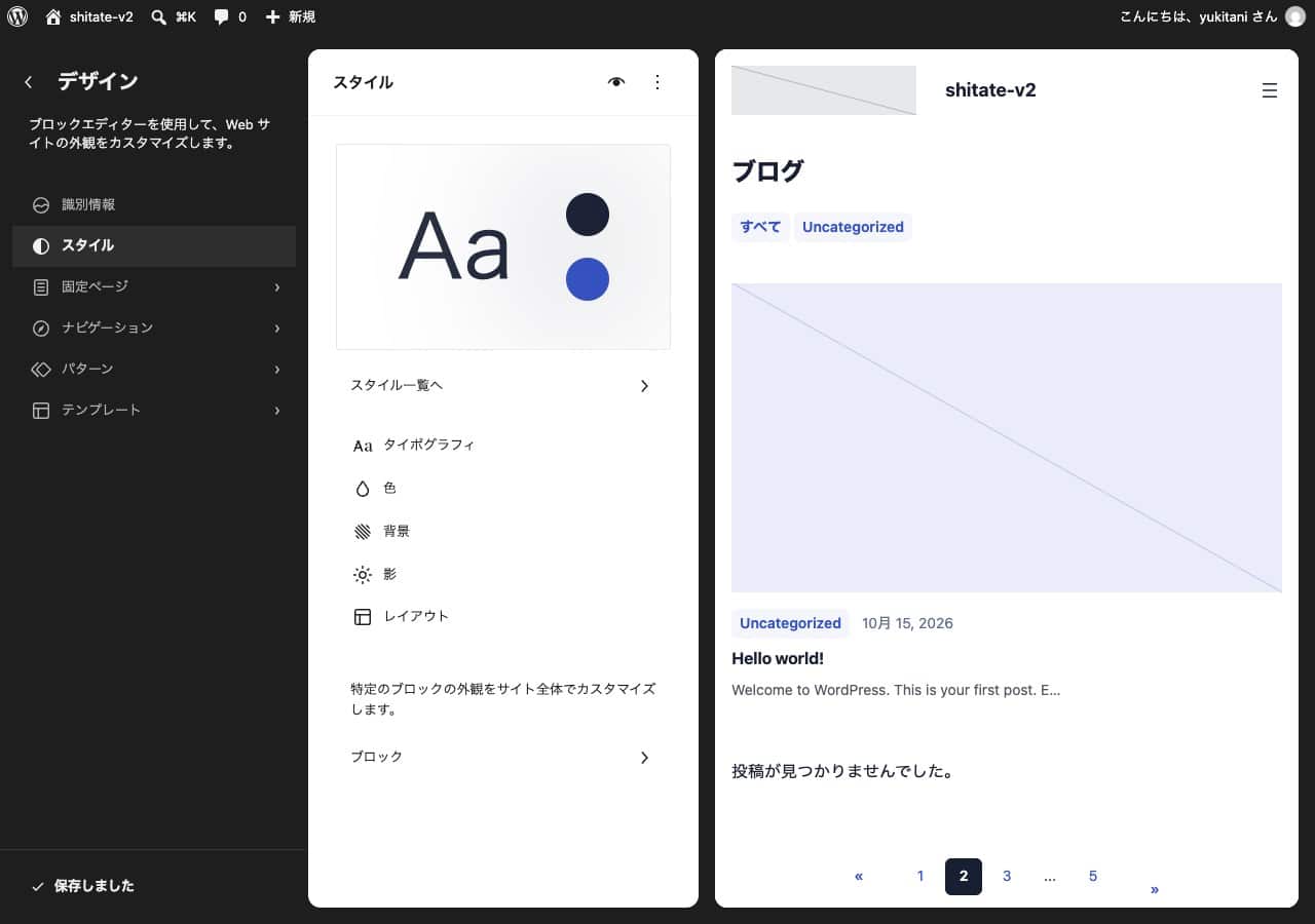
- Open "Appearance" → "Editor" (it will appear as "Design" in the top left corner)
- Press "Style" on the left side
- Press "To Style List"
- Choose the color swatch that matches your preferences from the color swatch next to "Color Variations." The look on the right side of the site will change immediately.
- Press the "Save" button in the upper-right corner of the screen.
Change the color one by one
If you want to match the color of the company logo, open the "Color" and "Palette Editor" screens in the "Style" window. If you press the nine colors listed in the "Theme" column, you can change each color one at a time. However, you should only change the four colors in the "Choose Your Own" table that are listed below.
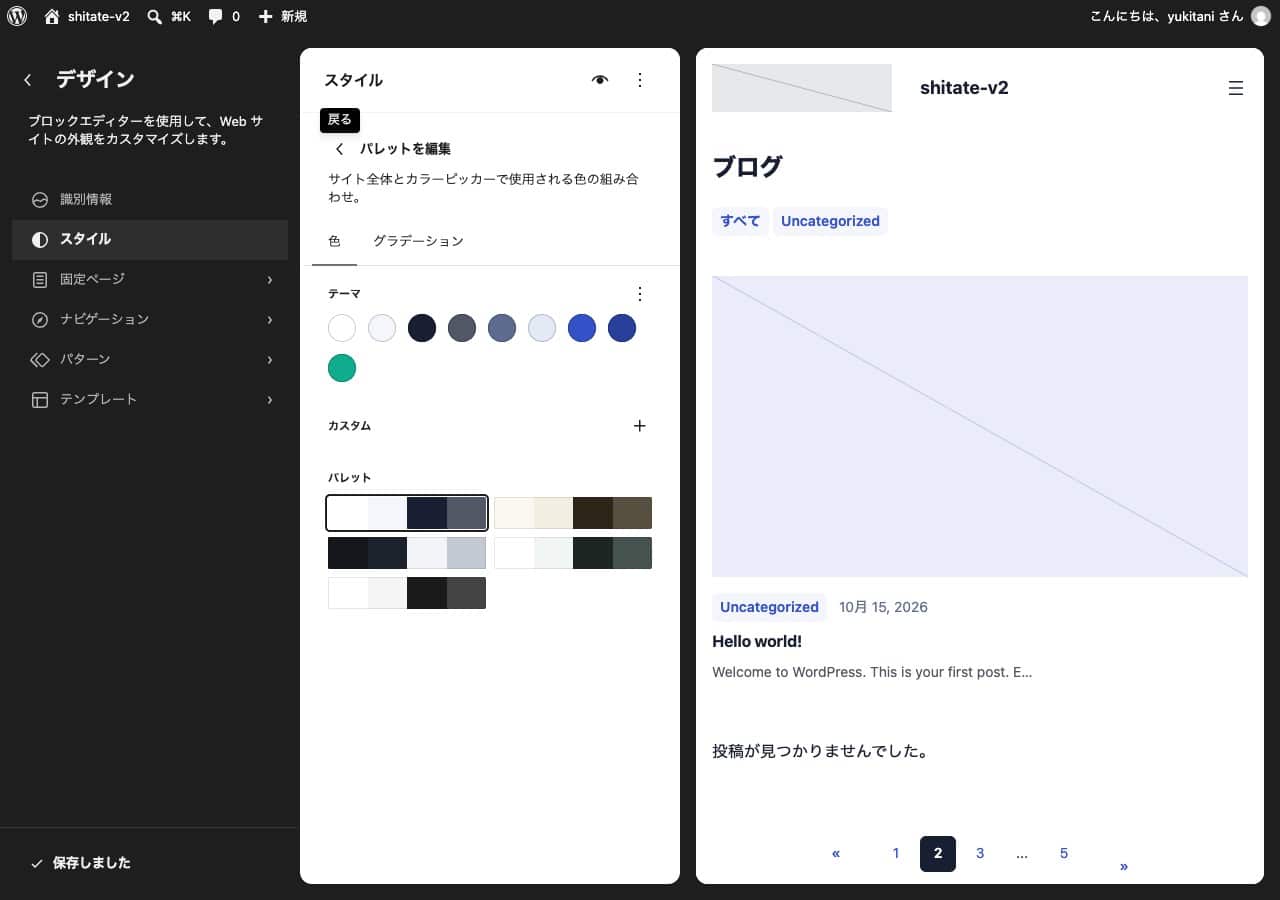
The name of the color is displayed in English. The main roles of colors are as follows:
| Name of the color | Where it is used | How to decide |
|---|---|---|
| Base | Background of the page | Choose for yourself |
| Base / Two | Backgrounds with a thin color (stripes on the table, category buttons, etc.) | Automatic |
| Contrast | Text in the body and the title | Choose for yourself |
| Contrast / Two | Additional characters | Automatic |
| Neutral | Subtle text such as dates and annotations | Automatic |
| Border | Border | Automatic |
| Primary | Links and buttons. This is the "main color" of the site. | Choose for yourself |
| Primary / Hover | The color when you hover the mouse over links and buttons | Automatic |
| Accent | Accent colors | Choose for yourself |
Choosing for yourself Only the 4 colors: Base, Contrast, Primary, and AccentThe five colors of "Auto" are calculated and determined based on shitate these four colors. For example, if you want to change the main color, you can simply change the Primary color and save it; when you hover over the mouse, the color of the Primary (Primary/Hover) and the background (Base/Two) will also change to the new Primary color. The color of the border (table and citation lines) and the underline of the text are also automatically determined in the same way.
The colors change automatically only after you save them. They don’t appear immediately on the editing screen, so please refresh the page after saving to check. Also, if you change the “automatic” color yourself, that color will be used as is, and changing other colors will not be able to be changed with the automatic function. When you return to the original four colors, the automatic color will also return to its original state.
Settings per page (shitateSettings)
Use this for when you want to make the title of only this fixed page larger. The settings for the entire site do not change.
- Open the post you want to change, or the edit screen for a fixed page.
- If the settings are not displayed on the right side of the screen, press the square icon to the left of the "Save" button at the top right.
- Open the "shitateSettings" button with the blue mark in it, located in the "Posts" (or "Pages" on fixed pages) tab on the right.
- Select "Scale Ratio" and "Body Size." The text on the editing screen changes immediately, so you can choose it while checking it.
- Press the "Save" button
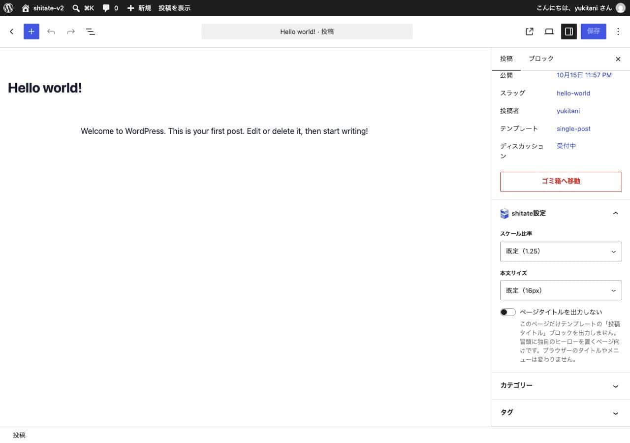
Selecting "Default" will return you to the settings for the entire site.
In the same placeDo not output page titlesIf you turn on "Show only this page," the title of the page that automatically appears above it will disappear. This is useful when creating a top page with a large photo and a headline, or a campaign page. The title that appears in the browser tabs or menus will remain intact.
Menu in the header
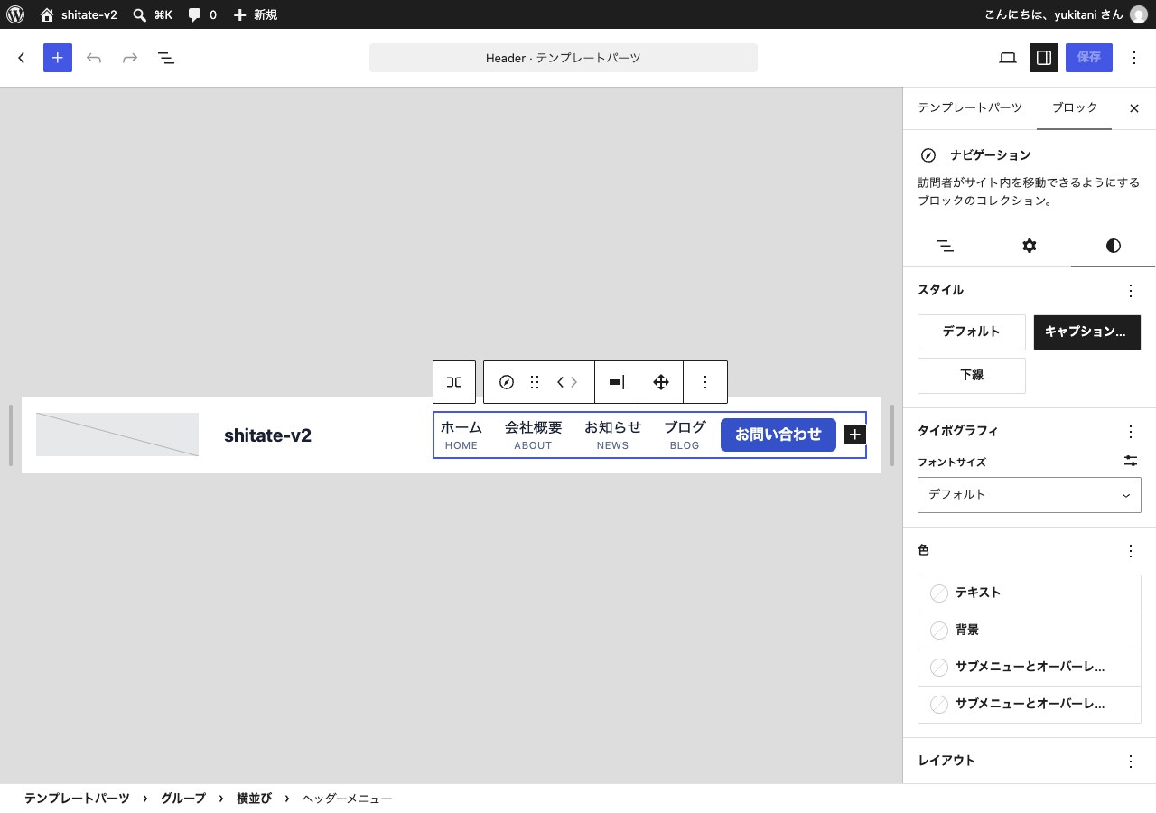
shitate The menu in the header can be displayed with a small English description (caption) below the Japanese item names. The items in the currently open page are highlighted in color.
Insert a caption
- Open "Appearance" → "Editor", then press "Pattern" on the left side.
- Click "Header" under "Template Parts List," then open the editing screen by clicking the header that appears.
- Click on the menu item you want to add a caption to (for example: "News").
- In the "Description" field on the "Block" tab on the right, enter the text you want to be the caption (for example: NEWS).
- Enter the same information for the other items, and finally press the "Save" button in the upper right corner of the screen.
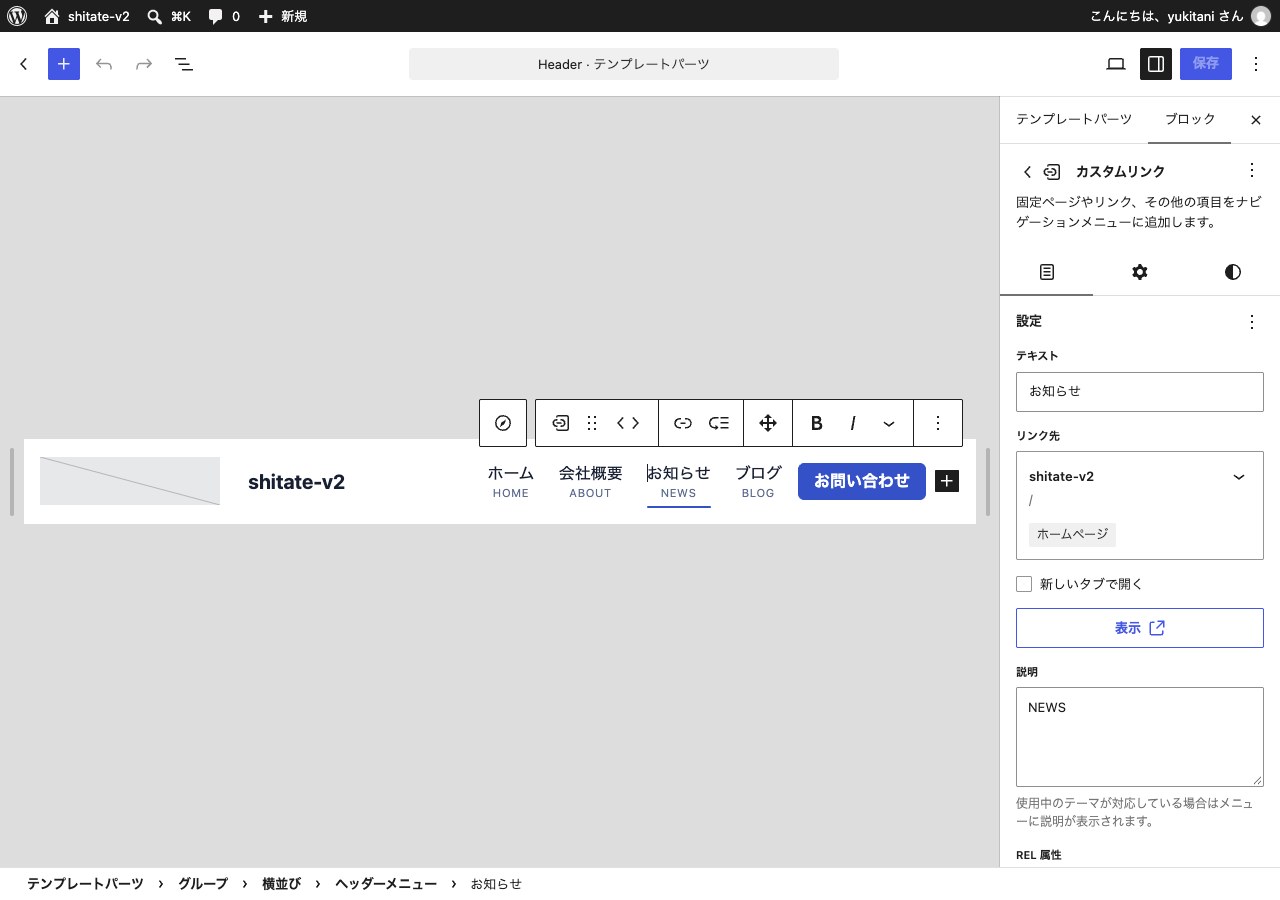
Items that are left blank in the "Description" field will be displayed without captions. If you used the "Description" field for menu items in an earlier theme, you can use it in the same way.
Change the look of the menu
Select the entire menu (you can choose it by pressing "Navigation" or the menu name in the bottom row of the screen), then press the "Style" icon in the semicircle on the right to choose the appearance.
- With captionsDisplays a caption below the item name (this is the default appearance from the beginning).
- UnderlineNo caption is displayed, and the item name and the underline are all that is visible.
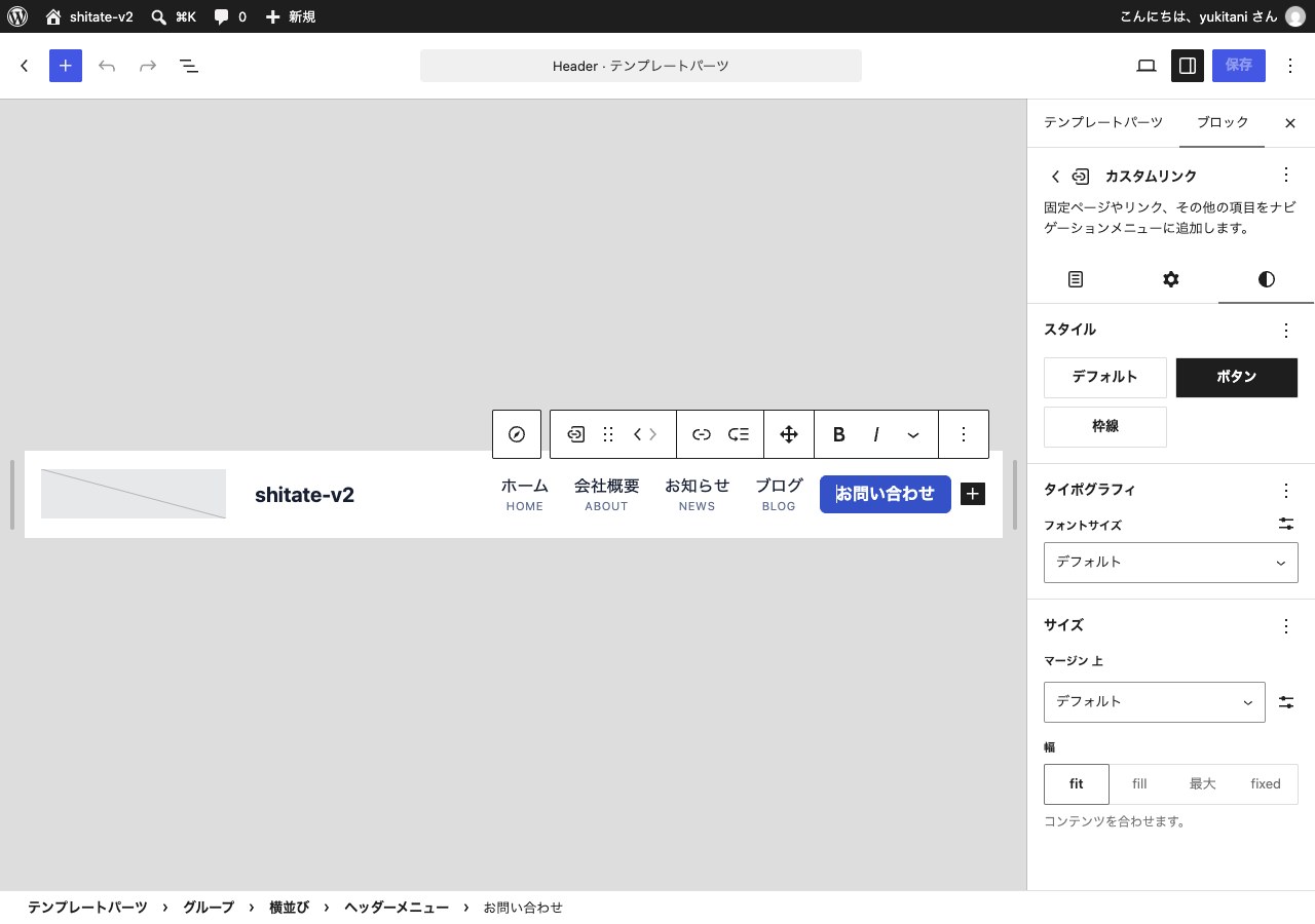
Make the "Contact Us" button
Click on one of the items in the menu and in the "Style" section on the right, select "Button"(Button painted in color) or "BorderIf you select "Button with only a border," the item becomes a button. Placing it near "Inquiries," for example, at the right edge of the menu makes it easier to spot. In a smartphone menu, it becomes a button that takes up the entire width of the screen.
List of blogs
The list of blogs is displayed in the following format from the beginning. Below the title, the list of categories is arranged in a button-like format, making it easier for readers to move to other categories.
- Top of the blog:I will make the latest article larger and arrange the rest of the cards in order.
- List of categories and search resultsPlace the photos on the left, with the title and summary on the right, and arrange them in order.
Change the order
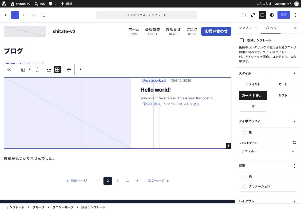
- Open "Appearance" → "Editor" → "Templates," then select the list you want to change. The top of the blog is "Index," the list for each category is "Archive," and the search results are "Search Results."
- Click on the section where the articles are listed, and press "Post Template" in the bottom of the screen.
- Select the order in "Style" on the right, then press the "Save" button.
| Style | Appearance | The correct way to use it |
|---|---|---|
| Card | Arrange the cards with photos in a grid pattern. | A blog full of photos |
| Card (the first one in large size) | The latest 1 item is highlighted, and the rest are cards. | Top of the blog |
| List | One photo on the left, one text on the right, one at a time | Categories with many articles, search results |
| 行 | List the date, category, and title in one line. | News and updates |
Make the list more readable
- Put an explanation at the top of the blogIn "Settings" > "Display Settings," open the fixed page you selected in "Post Page," and when you write the introduction text in the "Excerpt" on the right side, it will appear next to the title of the blog's top page.
- Marking recommended articlesIf you turn on "Fix on top of blog" on the right side of the article editing screen, the article will appear at the top of the list and "PICKUP" will be displayed in the upper left corner of the photo.
- Set up the photosThe card in the list uses the "headline image" from the article. Setting it for each article makes the list more attractive.
Pattern
A "pattern" is a finished design that combines headings, text, photos, and buttons. You can create a page by pasting it and then replacing the text and photos.
- In the Edit page settings screen, press the blue "+" button in the top left corner.
- Open the "Patterns" tab and select "From shitate" from the list.
- Clicking on the design you want to use will add it to the page.
- Click on the text to replace it. Click on the photo to replace it from the "Replace" toolbar.
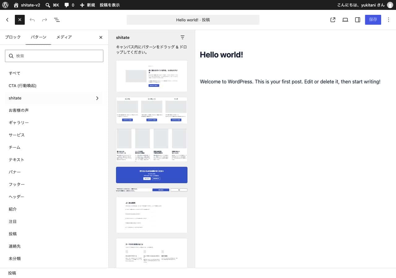
It contains 17 types of frequently used features on company and shop websites, such as the large headline on the homepage (the hero), company introduction, a list of services, pricing, frequently asked questions, customer testimonials, staff introduction, information for inquiries, the latest articles, and a list of announcements. You can also view the list from "Appearance" → "Patterns" in the admin panel.
Fine visual adjustments
Block top and bottom margins
Clicking on a block will bring up a row of small tools (toolbar) above the block. By pressing the “Spacing” icon in the cross arrow within it, you can select the top margin (top space), bottom margin (bottom space), and inner and outer padding (inner space) in increments from XXS to XXXL. Without entering any numerical values, the entire site will be set to the same spacing. To return to the original setting, press “Clear spacing class.”
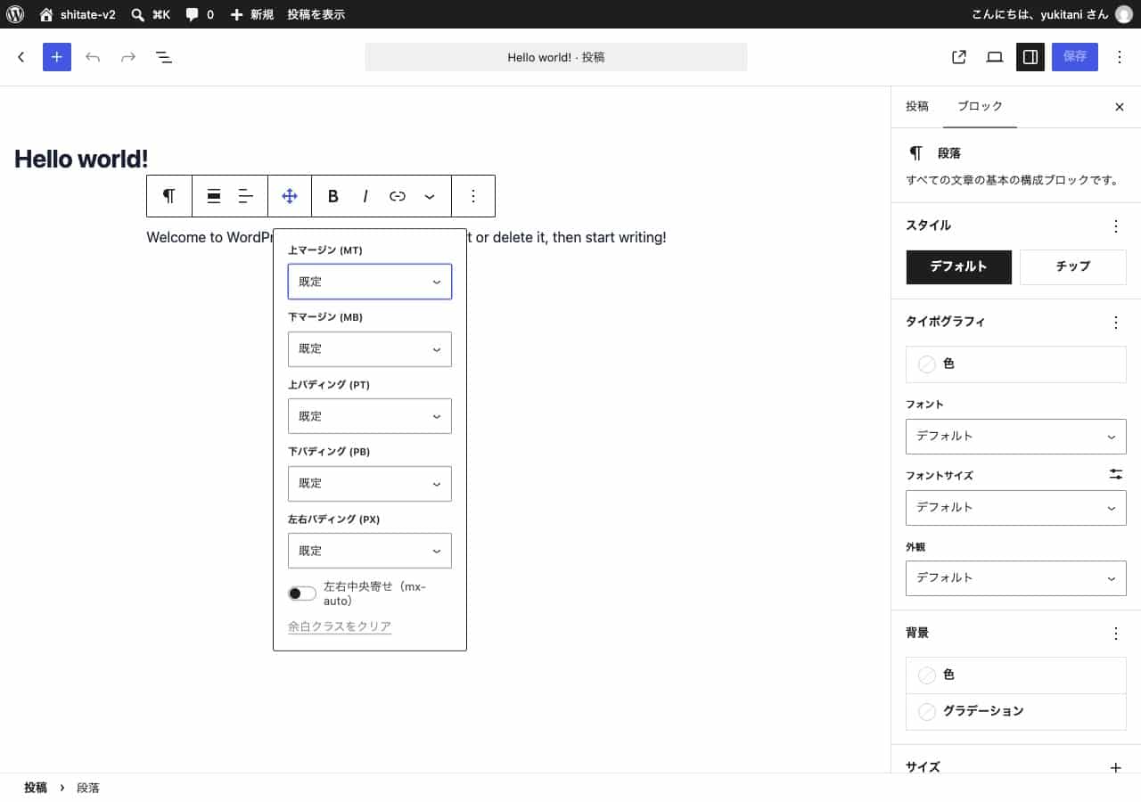
The "style" of the block
The next block changes the appearance by simply clicking and selecting "Style" on the right side.
- Breadcrumbs list "One line (horizontal scrolling)"Displays the path from "Home / Category / Article Name" in one line without folding the path. Even if it gets long on a smartphone, you can read it by scrolling it horizontally.
- "Tips" for categories and tags and paragraphs:Arrange the links in a form similar to a small button.
- "2 lines omitted" in the post title and excerptCut the long title and summary into two lines, and add “…” to the continuation. When the card heights are aligned, the list is ready to be viewed.
Points to note
- The "Customization" settings are not reflected in the site visitors' view until they press "Publish" for the "Public" setting and "Save" for the "Editor" setting.
- shitate Starting with 1.0.6, the server's PHP version must be 8.3 or higher. If it is older than 8.3, the "Publish" button on the customization screen will become "Not enabled," and you will not be able to save your settings. Please check the PHP version in the server management screen.
- Templates and headers that you have saved in the "Editor" will remain the same even when you update the theme. If you want to return to the new design of the theme, select "Reset" from the "︙" menu in the "Editor" template.
First, let's start with these three things:
There aren’t many settings to configure. If you’re unsure, just choose the three following shitate options to get your entire site up and running. Then, just paste the patterns and replace the text and photos. The headings and margins will be adjusted accordingly.
- Choose a ratio using "Customization" (if you're unsure, leave it at 1.25).
- Check the "Optimizing Japanese typesetting" option.
- In the "Style" section of "Editor," choose a color combination.