
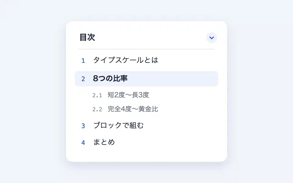
The TOC block automatically creates a TOC by collecting the headings (from H2 onwards) on that page. The anchor ID to the headings is also automatically attached, so there is no need to configure anything on the TOC block side. Whether placed in the post body or in the post template in the site editor, the same TOC is generated from the post’s headings.
Actual display
Since this manual is located on the site that is currently shitate pro blocks running, the following isReal blocks, not imagesHowever, please actually click on it, open it, and check the movement to confirm its functionality.
↑ This table of contents is a real table of contents generated automatically from the article's title (opens in a pop-up when opened in initial state).
Basic usage
- From "shitate unique blocks"Table of ContentsAdd the following code. The location for placing it can be either at the beginning of the body text or in a post template in the site editor (such as the sidebar).
- Editors will see a preview of the table of contents right on the page from the title they are editing (if the title has not yet been created, a notice will be displayed).
- If necessary, change the title, set the presence of header levels and numbers, and whether the sidebar is open or closed.
On the front end, pages without a title are not outputted per section block (no empty frames are left).
Settings screen in the editor
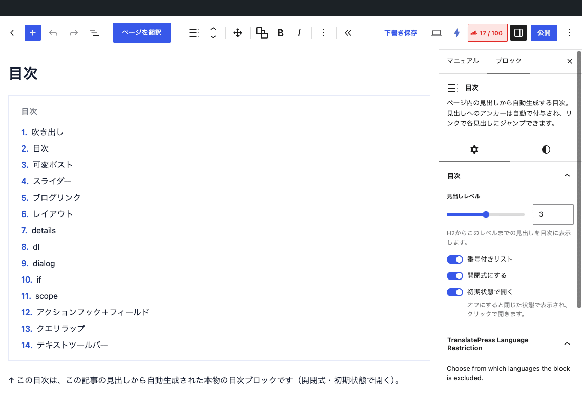
Settings
- Title(Direct editing on the block) — When empty, it displays "Table of Contents" (translated according to the site's language; previously "Index" in 1.7.2). You can use the text toolbar decorations.
- At the headline level — Which level to pick from H2 (H2 to H4; the initial value is H3).
- Numbered list — set to On (default value) for a hierarchy number like 1/1-1/1-2, and off for a brand color point.
- Make it an opening and closing type — If turned on, it becomes an accordion that opens and closes using the same mechanism as the details block (the icon is a plus/minus).
- Opens in its initial state(Only when opened and closed) — When turned off, it will be displayed in closed state and can be opened by clicking.
The anchor mechanism
- The title blocks in the body of the text contain an ID determined by the post ID and the title text (
sb-toc-xxxxxxxx) is automatically attached. It remains the same ID each time you save it, so it won't be broken even if you link to it from outside. - If the "HTML anchor" in the header block has an ID entered manually, we will link to that one first.
- If there are multiple headings for the same text, the ID will also be the same, and you will be moved to the first heading. If you want to distinguish between them, please manually attach an anchor to one of them.
- If the heading in the if block is the only one displayed, only the branch will be included in the TOC.
Filters
The default title for the entire site is Table of Contents This can be changed. The same value is also reflected in the editor's placeholders.
add_filter( 'sb_toc_default_title', fn() => 'The content of this article' );Smooth scrolling is turned off by default. If you enable it with a filter, html { scroll-behavior: smooth } To output the TOC, all the page-level anchors are smoothly scrolled (not applicable to users with the "Reduce parallax effect" setting). If there is a fixed header, you can also specify a margin of the same height.
add_filter( 'sb_toc_smooth_scroll', '__return_true' );
add_filter( 'sb_toc_scroll_padding', fn() => '5rem' ); // Fixed header height (px/rem/em/vh/ % can be used)
Customizing with CSS
It has a deliberately simple design, making it easy to adjust using CSS. The main body is made of .sb-tocThe parts are -title -list -bodyWhen numbered, the state class is-numbered When opening and closing, the shared parts are exposed. .sb-toggle If it is attached, the icon is replaced with the same variable as details.
/* 枠の角丸(カード類と共通) */
:root { --sb-radius: 0.5rem; }

/* 開閉アイコンをシェブロンに(内蔵アイコン: plus / minus / chevron-* / arrow-* / triangle-up / triangle-down) */
.sb-toc {
	--sb-icon-close: var(--sb-icon-chevron-down);
	--sb-icon-open: var(--sb-icon-chevron-up);
}
Points to note
- The only thing that gets picked up is the "heading" block provided by WordPress. Other block-level headings and template-level headings are not included.
- The editor preview is approximate. There may be slight differences from the front version, such as the display of the title for all branches of the if block.
- The opening and closing functions share the script in the details block.