
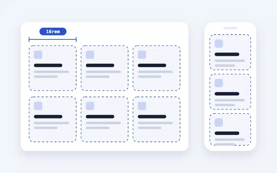
The layout is a responsive grid without breakpoints. Simply set the "minimum width of a column," and the boxes automatically adjust to the width of the screen. Each box can be freely filled with blocks, and the entire box can be linked or covered with a background image. It is a block designed to eliminate the "time-consuming adjustment of the width of the column blocks" problem faced by production companies on the construction site.
Actual display
Since this manual is located on the site that is currently shitate pro blocks running, the following isReal blocks, not imagesHowever, please actually click on it, open it, and check the movement to confirm its functionality.
Basic usage
- From "shitate unique blocks"LayoutWe will add a box. Initially, there are three boxes.
- Inside each box, insert any blocks you want, such as paragraphs, images, headings, buttons, etc.
- When adding more boxes, press the “+” at the end (to add a box).
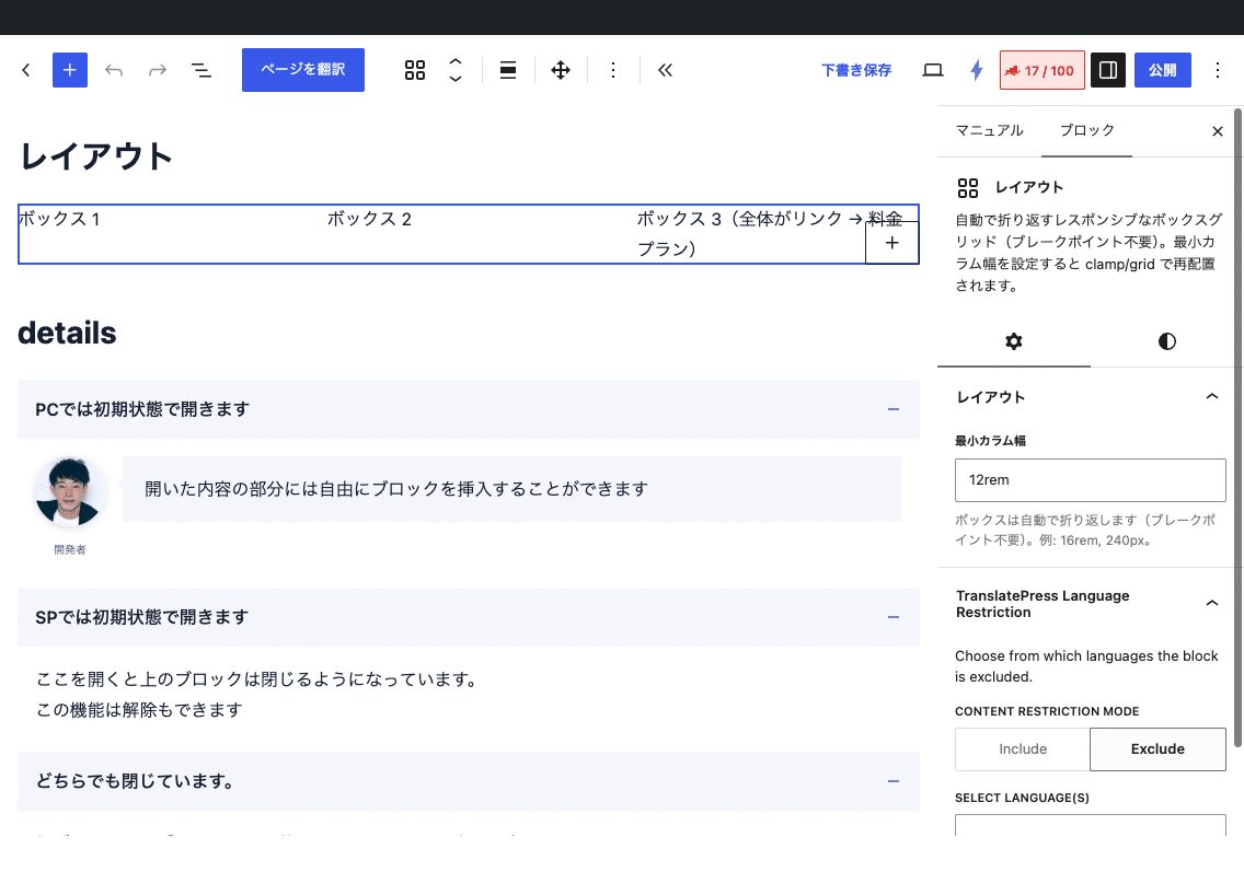
- In the "Minimum Column Width" section of the sidebar, you can set the minimum width for a single column. On narrow screens, the number of columns is reduced to ensure that it does not fall below this width, ultimately resulting in a single column.
Settings screen in the editor
Settings
Layout (parent)
- Minimum column width — For example:
16rem(Initial value),240pxCSS variables--st-colIt will be output as - Wide-spread placement, block spacing, padding, and color (background and text)—core settings can be used.
Box (child)
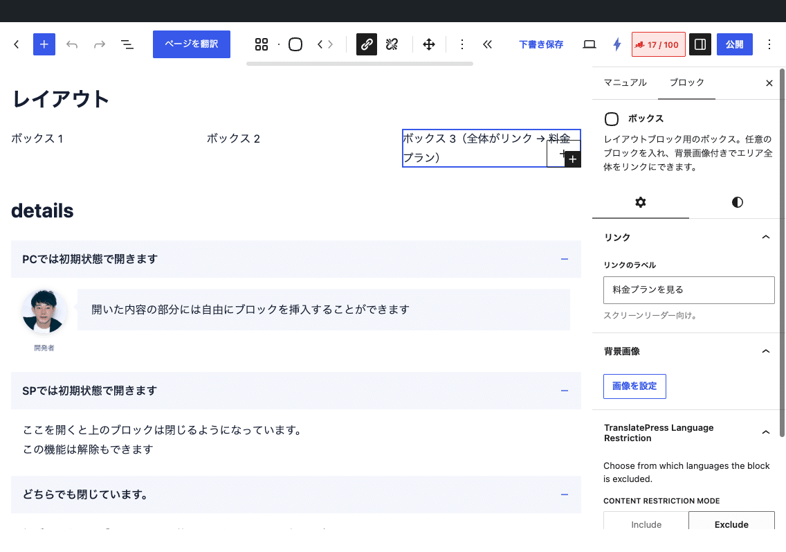
- Link(Toolbar) — The same operation as the core button block. From the link icon, set the URL and "Open in new tab" via popover, then click "Unlink" to remove it. When set, the entire box becomes a clickable area.
- Link label(Sidebar) — Link name for screen readers.If you link the box, please include it.(The overlay link itself has no content, so it would be an unnamed link without this).
- Background image(Sidebar) — laid out in a cover-centered arrangement.
- Padding, color, and border (rounded corners, color, and thickness)—You can use core settings.
Movement of the linked box
The box that has the link set has a transparent link at the end (<a class="-link">) is added and covers the entire box. The links, buttons, and form input fields placed inside the box are lifted onto it, so they operate individually (the contents of the dialog block are not included). JavaScript is not used.
Interchangeable with column blocks
In the Block Transformation menu, you can transform the core "columns" block and the layout with each other. Each column corresponds to each box. Block-specific settings such as specifying the width of the columns are not inherited.
HTML and CSS output
<div class="sb-layout" style="--st-col:16rem">
  <div class="sb-box" style="background-image:url(…)">
    …The contents…
    <a class="-link" href="/en/…/" aria-label="…"></a>  Only when setting links
  </div>
</div>
The grid is repeat(auto-fit, minmax(min(var(--st-col, 16rem), 100%), 1fr))The interval is the block interval between the cores (if not --st-space-l) The spacing between the elements in the box is --st-space-l So, the leading and trailing spaces are automatically set to 0.
/* 背景画像付きボックスの文字を白く、下寄せに */
.sb-box[style*="background-image"] {
	color: #fff;
	display: flex;
	flex-direction: column;
	justify-content: flex-end;
	min-height: 16rem;
}
Points to note
- The "minimum column width" is not validated and is simply included in the CSS. If you forget the unit, it will no longer be effective.
- Boxes can only be placed within the layout.
- The background image is a CSS background, so it doesn't have an alt tag and won't be loaded slowly. Please include meaningful images in the image block.
- Boxes saved before 1.6.1 (
-box/-box__linkFurthermore, it is even older.-box__contentWhen opened in the editor, it will automatically transition to the new format. Since the old page that hasn’t been opened doesn’t receive the new CSS, please save it again.