
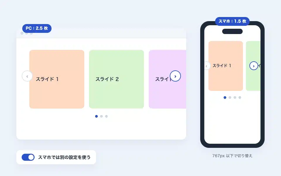
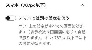
By default, the slider block settings are the same for both PCs and smartphones. In the "Smartphone (767px or less)" panel in the sidebar,"Use a different setting on the smartphone"If you turn on this option, you can separately set the number of screens to display at the same time, autoplay, arrows, dots (thumbnails in media sliders and 1-pixel width and speed in logo sliders), and the size of the thumbnail in the media slider.shitate pro blocks Added in 1.8.3.
Actual display
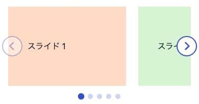
This manual is shitate pro blocks located on the site that is running, so the next slider isReal blocks, not imagesYes. On the PC, the display setting is 2.5 images, and on the smartphone (767px or less), it is 1.5 images. The number of images changes when you change the width of the browser.
How to set it up
- Select the slider block and open the "Mobile (767px or less)" panel in the sidebar.
- Turn on "Use a different setting on the smartphone."
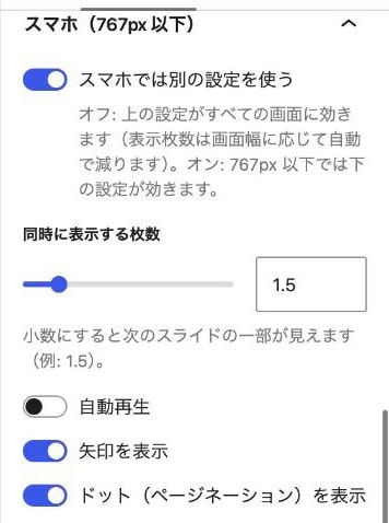
- Set the items that appear below to be for smartphones. The settings for PCs remain the same in the "Slider" panel above.
Items that can be configured
Box slider/media slider
- Number of items displayed at the same time — 1 to 4.0.1 increments; you can also specify fractions like 1.5 (discussed later). When the transition effect fades, it is always 1, so this item is not displayed.
- Auto-play — You can only stop (or start) autoplay on your mobile device. The interval and pause behavior is the same as on a PC.
- Show arrows/Display dot (page numbering) — In a narrow screen, you can use it by turning off the arrows and making it just a swipe.
- Display thumbnail — In the media slider, it only appears when "Show thumbnail" on the PC side is turned on. When turned off, it hides the thumbnail strip on the smartphone.
Loops, transition effects (slides/fade), speed of transition, interval between automatic playback, position of arrows, dot type, centering, and permission to drag/swipe are common to both PC and mobile devices.
logo slider
- Width per sheet — This works when you specify a width on the PC side. If the field is empty, the width is the same as on the PC side.
- Flowing speed — 0.2 to 3. For smartphones, adjust to make it a little slower.
Display on PC and smartphone
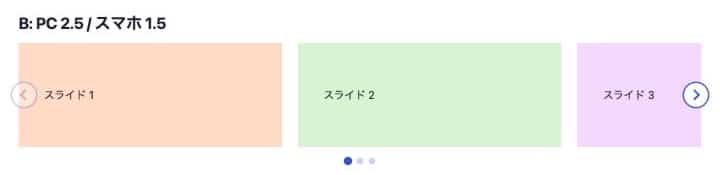
Here is the result of displaying the same settings (2.5 PCs and 1.5 smartphones) as the "Actual Display" above, with the width of the PC and smartphone displayed.
Automatic adjustment when off
When "Use a different setting on the smartphone" is turned off, the PC settings apply to all screens, butThe number of slides displayed at the same time is automatically reduced according to the screen width.。
| Screen width | Number of items displayed at the same time |
|---|---|
| 1024px or more | As configured |
| 768 to 1023px | Up to 2 cards (if the setting is less than 2, leave it as is) |
| Below 767px | 1 piece |
If you turn it on, this automatic adjustment will not be performed. Screens wider than 767px are set by PC settings, while those under 767px are set by smartphone settings. Please note that tablets between 768 and 1023px are set by PC settings.
Specified in decimal form
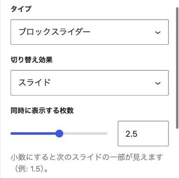
The number of slides can be specified as a decimal number, such as 1.5 or 2.5. When you specify a decimal number, the part of the next slide is visible at the edge, so it becomes easier to convey that there is still more to come. It can be used on both PCs and smartphones.
- The width of a single slide is the value divided by the number of slides (we also calculate the spacing between slides). The same principle applies as for integers: 1.5 means "1 slide + half".
- The movement is one card at a time. The last card stops at the position where the end slide aligns with the right edge.
- Auto adjustment during off mode is also performed in fractional increments. For example, at 2.5, 2 images are displayed at 768–1023px, and 1 image at 767px or less.
- It cannot be used in fade mode (it is always one card).
- The decimal specification will be added in the next version of 1.12.0. In earlier versions, it is only integer.
Points to note
- The border is 767px, the same as the plugin's CSS. The measurement is done based on the browser width, so when a tablet is used horizontally, the setting on the PC side may apply.
- Only the option to turn on/off auto-play is determined at the time the page is loaded. Changing the browser width after loading does not change the setting (the number of sheets, arrows, and dots are switched on the fly).
- The settings for mobile devices are only activated when turned on.
sb-sp-dataIt is saved as an attribute. Block markup that remains off will not change, so existing sliders will remain valid. - Sliders do not move within the editor. The view on a smartphone is from the front, so please narrow the browser width or check it on the actual device.